- Android TextView in Kotlin
- Dimensioning / Size
- Height / Width – Explicit
- Height / Width – Match Parent
- Height / Width – Wrap Content
- Height / Width – By Constraints
- Positioning
- Position by constraints
- Text Content
- Text Size
- Font Family
- Text Color
- SetTextColor from RGB / HEX colors
- SetTextColor from predefined values
- Text Style
- Text Alignment
- Background Color
- Text alignment with Gravity
- Gravity Properties
- Text Visibility
- Text Visibility with Alpha Channel
- Clickable Textview
- Additional Information and References
Android TextView in Kotlin
Android TextView is a UI component that is used to display text on the screen of an Android application. It is a versatile widget that can be customized to display different types of text, such as plain text, HTML formatted text, or even text with inline images. TextView can be used to display both static and dynamic text, and it supports various text formatting options, including font styles, sizes, colors, and alignment. Additionally, it can also handle user interaction by allowing the user to select, copy, and interact with the displayed text. Overall, TextView is an essential component for any Android app that requires text display functionality.
Dimensioning / Size
Height / Width – Explicit
- px : Pixels – Corresponds to actual pixels on the screen
- dp : Density-independent Pixels – An abstract unit that is based on the physical density of the screen.
- sp: Scale-independent Pixels – This is like the dp unit, but the user’s font size preference also scales it.
- pt: Points – 1/72 of an inch based on the physical size of the screen, assuming a 72dpi density screen.
- mm: Millimeters – Based on the physical size of the screen.
- in: Inches – Based on the physical size of the screen.
The best way to set exact dimensions is to do it directly in the XML layout file. The advantage is that it is directly calculated to the final pixel dimension. Defining the width and height programmatically is not as easy as setting the values directly in XML. The reason is that you must set the values in the layoutParams object of the textview. This object’s width and height are displayed in pixels. So you must convert every value to the corresponding pixel value.
It might happen that your text content will be bigger than the size of the textview. You should check the scrolling behavior in this case.
class MainActivity : AppCompatActivity() < override fun onCreate(savedInstanceState: Bundle?) < super.onCreate(savedInstanceState) setContentView(R.layout.activity_main) val small = findViewById(R.id.small) val big = findViewById(R.id.big) val displayMetrics = resources.displayMetrics small.layoutParams.width = displayMetrics.mmToPixel(50) small.layoutParams.height = displayMetrics.mmToPixel(10) big.layoutParams.width = displayMetrics.mmToPixel(50) big.layoutParams.height = displayMetrics.mmToPixel(50) > > fun DisplayMetrics.mmToPixel(value : Int) : Int < return (this.xdpi * (1.0f/25.4f) * value).toInt() >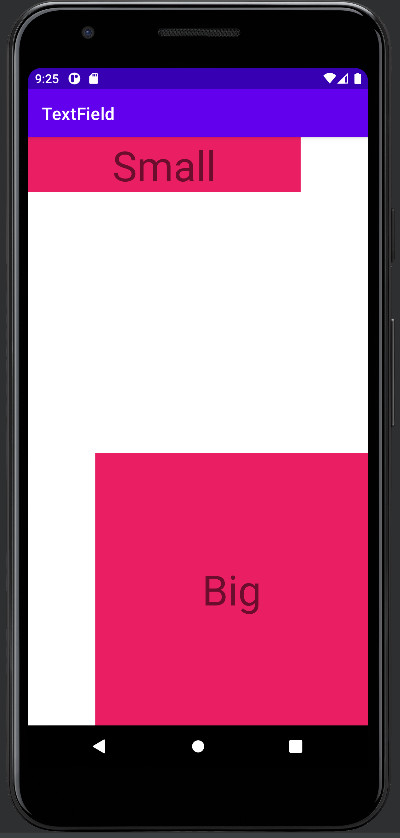
Height / Width – Match Parent
The second option is to match the dimension of the parent of the view. This option is great if your view needs to be responsive to auto-scaling. It will automatically adapt to any changes of the parent. When the parent container changes the textview will automatically adjust its size to fill the parent. You can create a view that is the full parent.
You can set the width and height of the textview by indicating match_parent in the XML layout file or by indicating it programmatically in the constructor of the LayoutParam Class. The MATCH_PARENT indicator is a constant integer (-1) that can be accessed by the static field in the ViewGroup.LayoutParams class.
val match = findViewById(R.id.match) val fixed = findViewById(R.id.fixed) match.layoutParams.width = ViewGroup.LayoutParams.MATCH_PARENT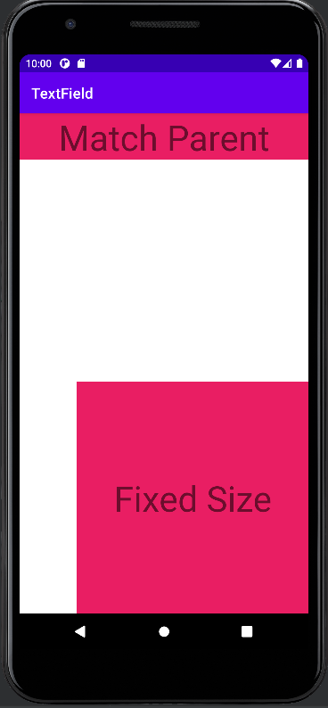
Height / Width – Wrap Content
In contrast to the match_parent , which adjusts the size of the textview to the parent, wrap_content will adjust the size of the textview to the containing text. This means that if you have a small text, the textview will be small. But it will automatically adjust to bigger texts as well. In this option, you don’t have to worry about scrolling behavior as your text is always visible.
You can set this option in the XML layout file with the wrap_content option. Programmatically, you can access similarly this option in the layoutParams member of the view, which you want to adapt.
val short = findViewById(R.id.shortText) val long = findViewById(R.id.longText) short.layoutParams.width = ViewGroup.LayoutParams.WRAP_CONTENT long.layoutParams.width = ViewGroup.LayoutParams.WRAP_CONTENT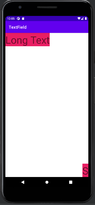
Height / Width – By Constraints
The last option we are going to propose is to control the size of the view by constraining its border to sibling views or parents. For example, if you constrain both the left and right border the width of the view will be correctly calculated. This option scales very well for different screen sizes. In combination with match_parent and wrap_content you will get a truly responsive layout.
Note that you must put the width (or height) to 0 dp to enable the system to calculate the size by constraints.
val left = findViewById(R.id.left) val constraint = findViewById(R.id.constraint) val right = findViewById(R.id.constraint) val params = constraint.layoutParams as ConstraintLayout.LayoutParams params.leftToRight = left.id params.rightToLeft = right.id constraint.requestLayout() 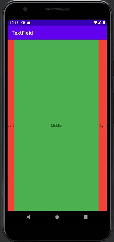
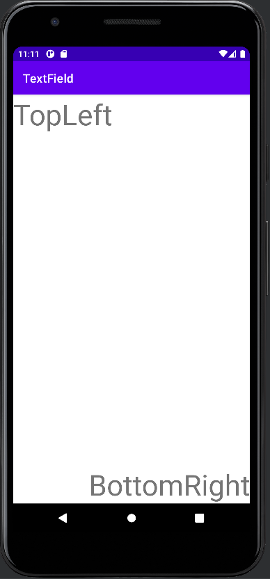
Positioning
Position by constraints
| Layout Constraint | ConstraintLayout.LayoutParams | Description |
|---|---|---|
| layout_constraintLeft_toLeftOf | leftToLeft | Left border to left border |
| layout_constraintLeft_toRightOf | leftToRight | Left border to right border |
| layout_constraintRight_toLeftOf | rightToLeft | Right border to left border |
| layout_constraintRight_toRightOf | rightToRight | Right border to right border |
| layout_constraintTop_toTopOf | topToTop | Top border to top border |
| layout_constraintTop_toBottomOf | topToBottom | Top border to bottom border |
| layout_constraintBottom_toTopOf | bottomToTop | Bottom border to top border |
| layout_constraintBottom_toBottomOf | bottomToBottom | Bottom border to bottom border |
| layout_constraintStart_toEndOf | startToEnd | Start of flow to end of flow |
| layout_constraintStart_toStartOf | startToStart | Start of flow to start flow |
| layout_constraintEnd_toStartOf | endToStart | End of flow to start of flow |
| layout_constraintEnd_toEndOf | endToEnd | End of flow to end of flow |
Text Content
The main property of a text view is naturally the text content. You can bind the content within XML by setting the “android:text” field. You can either write directly your text or you can reference it within a lookup value from a different resource file. This would be the preferred way if the text must not be dynamically available. In Kotlin code you can directly set the text property as shown below.
val view = findViewById(R.id.view) view.text = "Changed Hello World"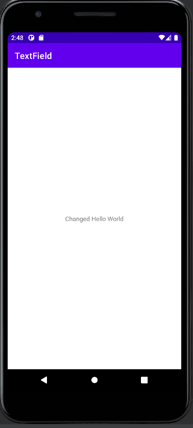
Text Size
The textsize determines how small or big the text will be displayed on your android phone. Ideally, this value should be defined in a resource file. You can set the textSize directly in the XML or programmatically.
val viewSmall= findViewById(R.id.viewSmall) val viewBig= findViewById(R.id.viewBig) viewSmall.textSize = 14F viewBig.textSize = 65F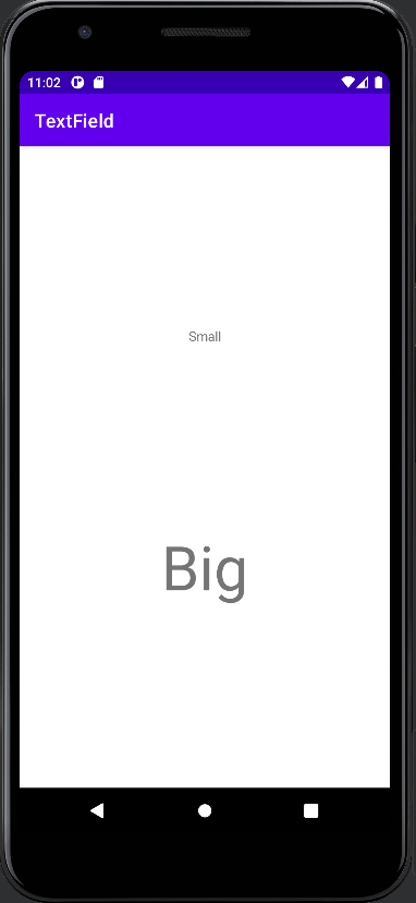
Font Family
Text Color
The Android framework provides several ways to set the text color, either statically in XML or programmatically in code.
SetTextColor from RGB / HEX colors
The first option is to use hardcoded RGB, RGBA or HEX colors. You can write them directly in your XML file. Or you can specify the text color programmatically in your Android app. When using the HEX, RGB colors in your Kotlin code, the build in Color class provides some nice feature to parse it.
Code: From HEX Color Code
val viewBlue = findViewById(R.id.viewBlue) val viewRed = findViewById(R.id.viewRed) viewBlue.setTextColor(Color.parseColor("#2196F3")); viewRed.setTextColor(Color.parseColor("#E91E63"));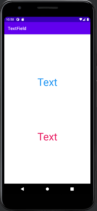
Code: From RGB / RGBA colors
viewBlue.setTextColor(Color.rgb(0, 0, 255)); viewRed.setTextColor(Color.rgb(255, 0, 0));SetTextColor from predefined values
The second option is to use predefined (named) colors. You can either use internally defined colors (such as Color.Blue ) or you can use your own colors, which you can specify in specific resource bundles.
Code: From internal predefined colors
The color class has some build in colors.
viewBlue.setTextColor(Color.BLUE); viewRed.setTextColor(Color.RED);Code / XML: From predefined colors
The colors in this example are defined in a resource bundle and can be accessed by the ContextCompat class.
viewBlue.setTextColor(ContextCompat.getColor(this, R.color.blue)); viewRed.setTextColor(ContextCompat.getColor(this, R.color.red));Text Style
With the textstyle you can control if your text is bold, italic or underlined. In XML it is quite straightforward. Programmatically it is not so easy to find, as you need to use the typeface interface.
val viewBold = findViewById(R.id.viewBold) val viewItalic = findViewById(R.id.viewItalic) viewBold.setTypeface(null, Typeface.BOLD); viewItalic.setTypeface(null, Typeface.ITALIC);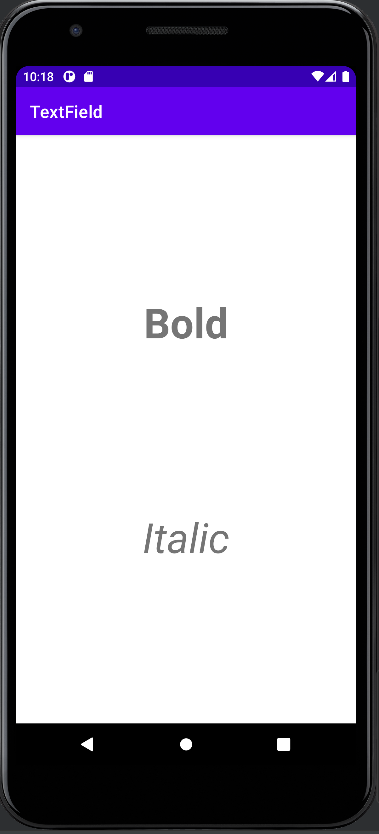
Text Alignment
Android provides several ways to align the text in you app. The text is aligned with respect to the textview width and height. This means you need to define width / height which is not “wrap_content”. The following option is the easiest way to do it. However, it is recommended to use the Gravity property as it gives you much more control about the text alignment.
val viewLeft= findViewById(R.id.viewLeft) val viewRight= findViewById(R.id.viewRight) viewLeft.textAlignment = TextView.TEXT_ALIGNMENT_TEXT_START; viewRight.textAlignment = TextView.TEXT_ALIGNMENT_TEXT_END;
Background Color
The background color can be easily given by using the “android:background” field. It accepts HEX color codes. You can also assign colors from other resources files.
Similar to the text color there are several ways to set programmatically the background color of a textview in Kotlin. You can either use color codes such as RGB/RGBA or HEX. Or you can use predefined colors. With predefined colors you can either use Androids predefined colors or you can create your own color resources.

val viewRed = findViewById(R.id.viewRed) val viewBlue = findViewById(R.id.viewBlue) // RGB Colors viewRed.setBackgroundColor(Color.rgb(255, 0, 0)) viewBlue.setBackgroundColor(Color.rgb(0, 0, 255)) // HEX Colors viewRed.setBackgroundColor(Color.parseColor("#E91E63")) viewBlue.setBackgroundColor(Color.parseColor("3F51B5")) // Predefined internal Colors viewRed.setBackgroundColor(Color.RED) viewBlue.setBackgroundColor(Color.BLUE) // Predefined XML Colors viewRed.setTextColor(ContextCompat.getColor(this, R.color.red)); viewBlue.setTextColor(ContextCompat.getColor(this, R.color.blue));Text alignment with Gravity
The most flexible way in aligning text within your app is to constrain the view and to give it; if necessary some width. Afterward, you can assign one or more gravity parameters to your view, which will affect the text position. You can set the gravity property in the Android XML file, or you can set the gravity parameter programmatically in your Kotlin code. Tip: Your view needs to have the correct width and height so that the gravity parameter works well (you should not use wrap_content).
Gravity Properties
The following options are available to align your text. They can be superimposed (as shown in the example) unless they are not contradictive to each other. For example, you can use Left and Right at the same time.
Within the XML you can specify several gravity properties by using the “|” symbol. In code, you can add (binary mask) the static field values of the public gravity class (LINK).
Text Visibility
The visibility of elements can be specified in the XML resource file with the “visibility” tag and the corresponding values.
In your Android application, you can programmatically set the visibility of the Kotlin text view by specifying the Enum values, coming from “View”.
val isVisible = findViewById(R.id.isVisible) val notVisible = findViewById(R.id.notVisible) isVisible.visibility = View.VISIBLE; notVisible.visibility = View.INVISIBLE;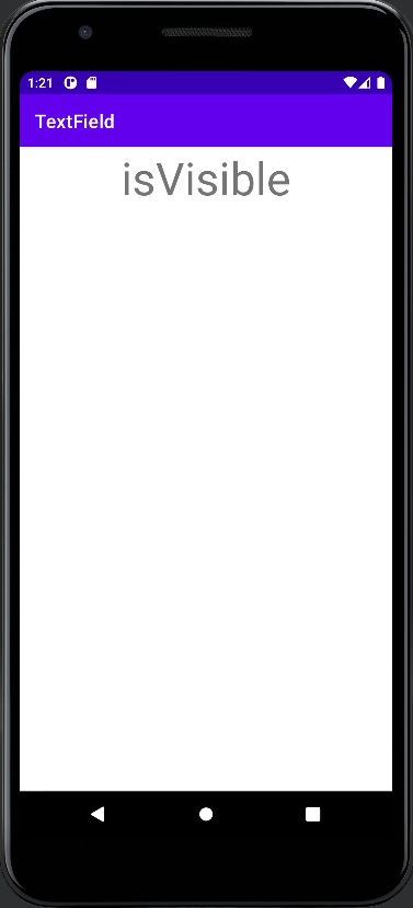
Text Visibility with Alpha Channel
Another option to control text visibility is to specify the alpha channel. With this option, you even have more control over the visual appearance than the previous option.
The alpha channel is a floating point number with a range of 0.0 – 1.0. If you indicate 0.0 the view will be completely invisible. If you indicate 1.0 the view will be 100 % visible. All numbers in between will make the view somewhat transparent. In our example, we have put the “Invisible” text view to 50 % transparency.
Once again you specify the alpha channel in the XML resource file of your Android app. This option is recommended for static views. The other way is to set the alpha value dynamically from your Kotlin project files.
val isVisible = findViewById(R.id.isVisible) val notVisible = findViewById(R.id.notVisible) isVisible.alpha = 1.0f; notVisible.alpha = 0.5f;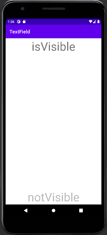
Clickable Textview
By default a textview is clickable. You can register any OnClickListeners or OnTouchListeners to handle click and touch events.
private var nClicks = 0 override fun onCreate(savedInstanceState: Bundle?) < super.onCreate(savedInstanceState) setContentView(R.layout.activity_main) val clickable = findViewById(R.id.isVisible) val notClickable = findViewById(R.id.notVisible) clickable.isClickable = true clickable.setOnClickListener < nClicks++; notClickable.text = "Clicked: $nClicks" >>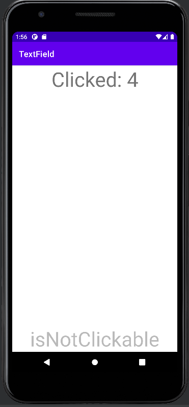
Additional Information and References
Official reference guide from Google