Виджет Tkinter Label в Python
Виджет Tkinter Label в Python используется для указания метки контейнера, в котором мы можем разместить текст или изображения. Этот виджет используется для сообщения пользователю о других виджетах, используемых в приложении Python.
Существуют различные параметры, которые можно указать для настройки текста или части текста, отображаемого в метке.
Синтаксис для использования метки приведен ниже.
Список возможных вариантов приведен ниже.
| № | Вариант | Описание |
|---|---|---|
| 1 | anchor | Он определяет точное положение текста в пределах размера, предоставленного виджету. Значение по умолчанию – ЦЕНТР, которое используется для центрирования текста в указанном пространстве. |
| 2 | bg | Цвет фона, отображаемый за виджетом. |
| 3 | bitmap | Используется для установки растрового изображения в указанный графический объект, чтобы метка могла представлять графику вместо текста. |
| 4 | bd | Представляет ширину границы. По умолчанию – 2 пикселя. |
| 5 | cursor | Указатель мыши изменится на указанный тип курсора, то есть стрелка, точка и т. д. |
| 6 | font | Тип шрифта текста, написанного внутри виджета. |
| 7 | fg | Цвет переднего плана текста, написанного внутри виджета. |
| 8 | height | Высота виджета. |
| 9 | image | Изображение, которое будет отображаться как метка. |
| 10 | justify | Он используется для представления ориентации текста, если текст содержит несколько строк. Он может быть установлен на ВЛЕВО для выравнивания по левому краю, ВПРАВО для выравнивания по правому краю и ЦЕНТР для выравнивания по центру. |
| 11 | Padx | Горизонтальный отступ текста. Значение по умолчанию – 1. |
| 12 | pady | Вертикальный отступ текста. Значение по умолчанию – 1. |
| 13 | relief | Тип границы. Значение по умолчанию – FLAT. |
| 14 | text | Задается строковая переменная, которая может содержать одну или несколько строк текста. |
| 15 | textvariable | Текст, записанный внутри виджета, устанавливается в управляющую переменную StringVar, чтобы к нему можно было получить доступ и изменить его соответствующим образом. |
| 16 | underline | Мы можем отобразить строку под указанной буквой текста. Установите этот параметр на номер буквы, под которой будет отображаться строка. |
| 17 | width | Ширина виджета. Указывается как количество символов. |
| 18 | wraplength | Вместо того, чтобы использовать только одну строку в качестве текста метки, мы можем разбить ее на количество строк, где каждая строка имеет количество символов, указанное в этой опции. |
Пример
# !/usr/bin/python3 from tkinter import * top = Tk() top.geometry("400x250") #creating label uname = Label(top, text = "Username").place(x = 30,y = 50) #creating label password = Label(top, text = "Password").place(x = 30, y = 90) sbmitbtn = Button(top, text = "Submit",activebackground = "pink", activeforeground = "blue").place(x = 30, y = 120) e1 = Entry(top,width = 20).place(x = 100, y = 50) e2 = Entry(top, width = 20).place(x = 100, y = 90) top.mainloop() Tkinter Label
Summary: in this tutorial, you’ll learn about Tkinter Label widget and how to use it to display a text or image on the screen.
Introduction to Tkinter Label widget
Tkinter Label widget is used to display a text or image on the screen. To use a Label widget, you use the following general syntax:
label = ttk.Label(container, **options)Code language: Python (python)The Label widget has many options that allow you to customize its appearance:
| Options | Meaning |
|---|---|
| anchor | When the text and/or image are smaller than the width, the anchor option determines where to position them tk.W , tk.CENTER or tk.E for left, center, and right alignment respectively. |
| background | Set the background color for the label |
| borderwidth | Add a border around the label. |
| class_ | Specify a custom widget class name for changing the label’s appearance. |
| compound | Specify how to display both text and image on the Label. |
| cursor | Specify the mouse cursor’s appearance when the mouse is over the widget. |
| font | Specify the font style for displaying text |
| foreground | Specify the color of the text |
| image | Specify an image or images to show in addition to text or instead of text. |
| justify | If the text contains newline characters, the justify option specifies how each line is positioned horizontally. The valid values are tk.LEFT (left-justify), tk.CENTER (center), and tk.RIGHT (right-justify). |
| padding | Add more space around the label. |
| relief | Use this option to create an effect for the Label .e.g, flat, raised, sunken, groove, and ridge. |
| style | Specify the custom widget style. |
| takefocus | is a boolean value that specifies whether the label is visited during focus traversal. It defaults to False which doesn’t get focus. |
| text | Specify a string of text to show in the widget |
| textvariable | A StringVar instance that holds the text value of the widget. It overrides the text option if both textvariable and text are available. |
| underline | Specify the position of the letter that should be underlined e.g, underline = 0 would underline the letter E in the text=’Exit’ |
| width | Specify the number of characters to show |
| wraplength | Chop the text into the lines which less than the length specified by the wraplength option. |
The following shows a skeleton program that we’ll use to illustrate various options of the Label widget:
import tkinter as tk from tkinter import ttk root = tk.Tk() root.geometry('300x200') root.resizable(False, False) root.title('Label Widget Demo') # show the label here root.mainloop()Code language: Python (python)Displaying a regular label
The following program shows how to display a regular label on the root window:
import tkinter as tk from tkinter.ttk import Label root = tk.Tk() root.geometry('300x200') root.resizable(False, False) root.title('Label Widget Demo') # show a label label = Label(root, text='This is a label') label.pack(ipadx=10, ipady=10) root.mainloop()Code language: Python (python)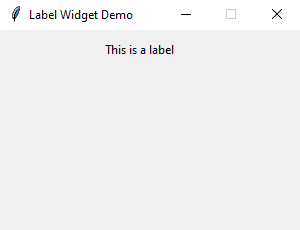
- First, import Label class from the tkinter.ttk module.
- Second, create the root window and set its properties including size, resizeable, and title.
- Third, create a new instance of the Label widget, set its container to the root window, and assign a literal string to its text property.
Setting a specific font for the Label
To set a particular font for a label, you pass the font keyword argument to the Label constructor like this:
font = ('font name', font_size)Code language: Python (python)The font keyword argument is a tuple that contains font name and size. For example:
font=("Helvetica", 14)Code language: Python (python)The following example shows a label with the Helvetica font:
import tkinter as tk from tkinter import ttk root = tk.Tk() root.geometry('300x200') root.resizable(False, False) root.title('Label Widget Demo') # label with a specific font label = ttk.Label( root, text='A Label with the Helvetica font', font=("Helvetica", 14)) label.pack(ipadx=10, ipady=10) root.mainloop() Code language: Python (python)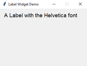
Displaying an image
To use a Label widget to display an image, you follow these steps:
First, create a PhotoImage widget by passing the path to the photo to the PhotoImage constructor:
photo = tk.PhotoImage(file='./assets/python.png')Code language: Python (python)Second, assign the PhotoImage object to the image option of the Label widget:
Label(. image=photo)Code language: Python (python)The following example shows how to use a Label widget to display an image:
import tkinter as tk from tkinter import ttk # create the root window root = tk.Tk() root.geometry('300x200') root.resizable(False, False) root.title('Label Widget Image') # display an image label photo = tk.PhotoImage(file='./assets/python.png') image_label = ttk.Label( root, image=photo, padding=5 ) image_label.pack() root.mainloop() Code language: Python (python)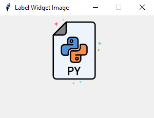
Note that the image file is located at the /assets/ folder.
To display both text and image, you’ll use the text attribute and compound option.
The compound option specifies the position of the image relative to the text. Its valid values are:
| Compound | Effect |
|---|---|
| ‘top’ | Display the image above the text. |
| ‘bottom’ | Display the image below the text. |
| ‘left’ | Display the image to the left of the text. |
| ‘right’ | Display the image to the right of the text. |
| ‘none’ | Display the image if there’s one, otherwise display the text. The compound option defaults to ‘none’ . |
| ‘text’ | Display the text, not the image |
| ‘image’ | Display the image, not the text. |
The following program shows how to display both text and image on a label:
import tkinter as tk from tkinter import ttk # create the root window root = tk.Tk() root.geometry('300x200') root.resizable(False, False) root.title('Label Widget Image') # display an image label photo = tk.PhotoImage(file='./assets/python.png') image_label = ttk.Label( root, image=photo, text='Python', compound='top' ) image_label.pack() root.mainloop() Code language: PHP (php)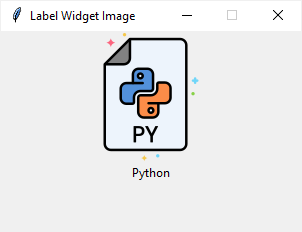
Summary
# Label — метка
Библиотека tkinter содержит набор компонентов или виджетов, одним из которых является метка — Label() . Метки (или надписи) — это достаточно простые виджеты, содержащие строку (или несколько строк) текста и служащие в основном для информирования пользователя.
from tkinter import * root = Tk() label = Label(root, text="This text wrote in the first label!") label.pack() root.mainloop() Для создания метки используется конструктор Label() . В этом конструкторе с помощью параметра text можно установить текст виджета. Чтобы сделать элемент видимым, у него вызывается метод pack() . В итоге вверху окна будет красоваться метка с текстом:
Для создания двух и более виджетов достаточно просто создать метку и добавить её в окно:
from tkinter import * root = Tk() label_1 = Label(root, text="This text wrote in the first label!") label_1.pack() label_2 = Label(root, text="This text wrote in the second label!") label_2.pack() root.mainloop() Каждый виджет, имеет ряд атрибутов, которые влияют на ее визуализацию и которые мы можем настроить через конструктор:
from tkinter import * root = Tk() label = Label(root, text="Hello", font=("Arial Bold", 50), bg="lightgreen") label.pack() root.mainloop() # Параметры виджета
Всего же виджет Label может принимать следующие параметры:
- anchor : управляет положением текста (или изображения) внутри метки. Допустимые значения: N, NE, E, SE, S, SW, W, NW или CENTER. По умолчанию это CENTER. (Заглавные сокращения букв, берутся от именования направлений North — север, South — юг, East — восток, West — запад)
- background/bg : устанавливает цвет фона виджета, по умолчанию зависит от платформы.
- bitmap : растровое изображение, отображаемое на виджете. Если указан параметр изображения, этот параметр игнорируется в автоматическом режиме.
- borderwidth/bd : ширина границы метки. Значение по умолчанию зависит от системы, но обычно составляет от 1 до 2 пикселей.
- compound : контролирует, как текст и изображения в пределах метки объединяются. По умолчанию, если задано изображение или растровое изображение, оно будет отображено вместо текста. Когда для этой опции установлено значение CENTER, на изображении отображается текст. Допустимые значения: BOTTOM, LEFT, RIGHT или TOP.
- cursor : курсор, отображаемый, когда мышь перемещается над меткой. По умолчанию используется стандартный курсор.
- disabledforeground : цвет переднего плана для использования, когда метка отключена или недействительна. Значение по умолчанию зависит от системы.
- font : шрифт, используемый для надписей. Метки могут содержать только один текст шрифта. Значение по умолчанию зависит от системы.
- foreground/fg : цвет метки, используемой для цвета текста и растровой метки. По умолчанию используется цвет заданный системой.
- height : высота метки. Если текст отображается на метке, размер указывается в текстовых единицах. Если изображение отображается в метке, размер указывается в пикселях (или единицах экрана). Если вы установите размер 0 или пропустите его, он рассчитывается на основе содержимого метки.
- image : изображение для отображения на виджете. Значением должно быть PhotoImage , BitmapImage или совместимый объект. Если указано, это переопределяет параметры текста и растрового изображения.
- padx : горизонтальные отступы для добавления текста. По умолчанию используется 1 пиксель.
- pady : вертикальный отступ, чтобы добавить вокруг текста. По умолчанию используется 1 пиксель.
# Упражнения
- Создайте окно с текстом в метке: «It is my first label».
- Создайте окно с тремя метками и текстов в них: «1-st label», «2-nd label», «3-rd label» соответственно.
- Для переноса строки в одном виджете можно использовать \n . Создайте окно c одной меткой, с текстом на две строки: «It is the first string\nand the second string».
- Создайте окно с выводом текста: «Письмо Деду Морозу». Вывод должен реализовываться при помощи одного Label и с использованием строки с переменными, в которых хранятся имя, город, год, подарок и т.п. Укажите выравнивание текста по центру.