Creating A Simple Pie Chart With CSS
A pie chart is a great way of showing the relationship between numbers, especially when showing percentages. Drawing a pie chart from scratch takes a fair amount of maths to get working and so people usually go for third party charting libraries in order to add charts to the page.
I recently came across a technique that allows you to create a pie chart using just CSS, which means you can create simple charts without including massive charting libraries into your page loads. This makes use of just a few lines of CSS, using conic-gradient() CSS function.
The conic-gradient() CSS function is part of the background style attribute and is part of a family of functions like radial-gradient() and linear-gradient(). It is used to create a gradient rotated around a central point and is opposite the radial-gradient() function that draws the gradients radiating away from the centre.
The syntax for drawing conic gradient is actually quite complex, but for the purposes of drawing pie charts we can simplify this complexity quite a bit. All we need to do is tell the gradient to draw segments of the chart as blocks of colour, with each block starting from the exact endpoint of the last segment. This is more of less the syntax we need to follow.
Using percentages for these values makes the chart easier to create and edit than the alternative units of degrees of radians, which can be a little harder to understand.
As an example, we can draw a 50/50 gradient using the conic-gradient function in the following way.
That just sets the background colour an element, so in order to get the full effect we also need to set some other style properties. A fixed height and width are useful to ensure the chart is square and we also set the border-radius value to 50%, which turns the block into a circle.
Creating A CSS Pie Chart
Let’s create a simple pie chart using what we have learned so far. First, we need to create a div that we can target to create the chart.
We can then create the styles needed to turn this into a pie chart. In the following example we are setting up a pie chart with four colours (red, blue, violet and green) of different sizes.
This results in the following output.
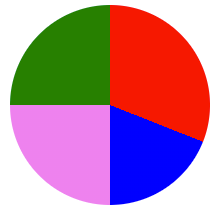
As you can see, this works very well.
A better approach to creating the chart is to create a generic set of styles for the pie charts we want to create and then inject the background styles as an inline set of styles. This means we can generate multiple different pie charts containing different data.
Here are the core styles we need to generate our CSS pie chart, but without the actual data in the background attribute.
The HTML we generate then contains the class to add in the background conic-gradient styles to create the data display for the chart.
This allows us to create multiple different pie charts on the same page by just injecting the data into the relevant div.
The technique here works well, but only works well for sites without dynamic content. Let’s take this a step further and use JavaScript to generate the data we need.
Using JavaScript To Generate CSS Pie Charts
A single JavaScript function is enough to generate the effect we need in conjunction with the generic pie chart styles to set the basic shape of the pie chart.
The two parameters we pass to the function are a class name that identifies the element we want to generate the chart data itself (including the colours). All the function does is map the data to the percentage value and generate the conic-gradient value using these values. This is then applied to the background style of the element.
; let total = 0; let length = 0; let last_value = 0; let background = ''; let number = 0; for (var item in chartData) < length++; total += chartData[item].data; >for (var item in chartData) < let value = Math.round(map(chartData[item].data, 0, total, 0, 100)); value += last_value; background += chartData[item].colour + ' ' + last_value + '% ' + value + '%'; if (number < length - 1) < background += ','; >last_value = value; number++; > jspie.style.background = ' conic-gradient(' + background + ')'; >The chart data contains the value and the colour to apply to the segment.
, 1 : < 'data': 15, 'colour': 'blue' >, 2: < 'data': 20, 'colour': 'violet' >, 3: < 'data': 20, 'colour': 'green' >> pieChart('js-pie', data);The HTML needed to generate the pie chart would be as follows.
Using this code we can now generate multiple pie charts on a page using just these elements.
If you want to see all of the previous examples in action then check out the CodePen I created that contains all of the code seen here. This creates a pie chart using full external styles, the generic styles and an inline component, and the JavaScript method of generating the chart.
Fixing Accessibility
The big problem with showing a pie chart in this way is that it is not accessible at all. This is somewhat understandable due to the way it’s created, but screen readers will simply not register the presence of the pie chart and will just ignore it.
A solution to this is to inject aria-* attributes into the markup in order to show the presence of visual representation of data on the page. Rather than just add lots of text to a single aria-label of the main div we can make things more interesting by adding separate elements that represent the data.
Let’s start with a more accessible root element that we can use to inject the pie chart into.
Our intent here is to generate inner div elements that will display the data of the pie chart. In order to do this we need to ensure that each of the inner elements sit on top of each other so that they still represent the data in the same way. The following styles handle this by showing the inner elements in an absolute position, relative to the outer div.
Next, we need to alter the pieChart() JavaScript function so that instead of creating a single background style we generate a set of div elements, each of which contain their own styles and aria-label attributes.
; let total = 0; let length = 0; let last_value = 0; for (var item in chartData) < length++; total += chartData[item].data; >for (var item in chartData) < let background = ''; let value = Math.round(map(chartData[item].data, 0, total, 0, 100)); var new_element = document.createElement('div'); new_element.setAttribute('aria-label', chartData[item].label + ' ' + value + '%') value += last_value; if (last_value >0) < background += 'transparent 0% ' + last_value + '%,'; >background += chartData[item].colour + ' ' + last_value + '% ' + value + '%'; background += ',transparent ' + value + '% 100%'; new_element.style.background = ' conic-gradient(' + background + ')'; jspie.append(new_element); last_value = value; > > pieChart('js-pie', data);To make this work we just need to alter the data array slightly to inject a label into the data. This is used to inject the aria-label attributes to the markup.
Running this code generates the following HTML. The aria-label elements here explain both the purpose of the chart and the data items within it.
You can find an example of this, more accessible version of the pie chart generation script in a separate CodePen. You can make the charts more independent of the page structure by making them into web components.
Generally, these pie charts should be used to show the relationship between two pieces of information in a confined space. They should act more or less like sparklines, which show very simple relationships within content these pie charts can be used to quickly represent some data within content. If you want to create more complex pie charts then there are plenty of charting libraries available that provide better functionality than this simple approach.
If you want to learn more about the conic-gradient function in CSS then the mdn web docs have an extensive page on the subject.

Phil is the founder and administrator of #! code and is an IT professional working in the North West of the UK. Graduating in 2003 from Aberystwyth University with an MSc in Computer Science Phil has previously worked as a database administrator, on an IT help desk, systems trainer, web architect, usability consultant, blogger and SEO specialist. Phil has lots of experience building and maintaining PHP websites as well as working with associated technologies like JavaScript, HTML, CSS, XML, Flex, Apache, MySQL and Linux.
Want to know more? Need some help?
Let us help! Hire us to provide training, advice, troubleshooting and more.
Support Us!
Please support us and allow us to continue writing articles.
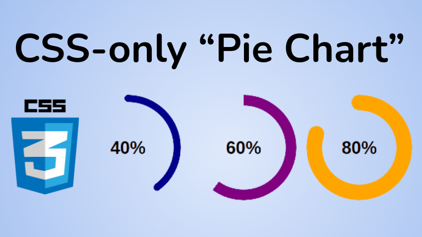
How to Create a Pie Chart Using Only CSS

Temani Afif
Pie charts are common components that let you show portions of a whole, and you can use them for many different purposes.
You will find a lot of articles around building such a component, but they typically either rely on SVG or a lot of HTML elements.
In this post, I will show you how to create a pie chart using CSS and only one element.
Below is an overview of what we are building:
Click to see the full code
@property --p< syntax: ''; inherits: true; initial-value: 1; > .pie < --p:20; --b:22px; --c:darkred; --w:150px; width: var(--w); aspect-ratio: 1; position: relative; display: inline-grid; margin: 5px; place-content: center; font-size: 25px; font-weight: bold; font-family: sans-serif; >.pie:before, .pie:after < content: ""; position: absolute; border-radius: 50%; >.pie:before < inset: 0; background: radial-gradient(farthest-side,var(--c) 98%,#0000) top/var(--b) var(--b) no-repeat, conic-gradient(var(--c) calc(var(--p)*1%),#0000 0); -webkit-mask: radial-gradient(farthest-side,#0000 calc(99% - var(--b)),#000 calc(100% - var(--b))); mask: radial-gradient(farthest-side,#0000 calc(99% - var(--b)),#000 calc(100% - var(--b))); >.pie:after < inset: calc(50% - var(--b)/2); background: var(--c); transform: rotate(calc(var(--p)*3.6deg)) translateY(calc(50% - var(--w)/2)); >.animate < animation: p 1s .5s both; >.no-round:before < background-size: 0 0, auto; >.no-round:after < content: none; >@keyframes p < from> 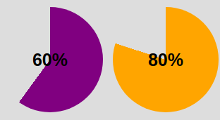
We are getting closer! The conic-gradient() is giving us a two-color gradient. From 0% to p% the main color and the remaining part is a transparent color (defined with the hexadecimal value #0000 ).
To keep only the border part we will use a mask to hide the middle part. We will use a radial-gradient() this time:
radial-gradient(farthest-side,red calc(99% - var(--b)),blue calc(100% - var(--b)))The above applied as a background will give us the following:
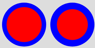
Note the use of the variable —b that defines the thickness of the border (shown as blue in the above).
Now imagine the red part being the invisible part and the blue part the visible one. This is what we will get if we use the same gradient with the mask property:

We have our pie chart with one element and a few lines of CSS code.
How to add the the rounded edges
For this I will add an extra gradient layer to round the top edge and a pseudo element to round the other edge. Here is an illustration to understand the trick:
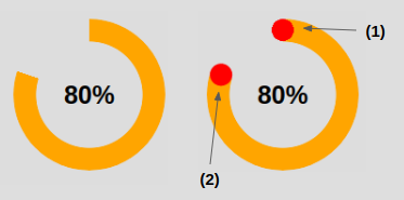
The code for (1) to round the top edge:
In addition to the conic-gradient() we add a radial-gradient() placed at the top that has a size equal to the border thickness defined by —b .
The code for (2) to round the other edge:
The inset property is setting the size of the pseudo-element to be equal to —b . Remember that it’s the shorthand for top , right , bottom and left . If we have
this means that from each side we are moving to the center minus an offset equal to b/2 – so we end up having a width equal to 2*b/2 = b . Same logic for the height.
Now we need to correctly place our element, which is why we use the transform property. Our element is initially placed at the center so we need to first rotate it. Having the percentage we use the «Rule of three» to get the angle:
angle = percentage*360deg/100Then we do a translation, and here we will need the width because we have to perform a translation by half the width ( w/2 ).
Ok, ok – you might be a bit lost within all these formulas. Find below an illustration to understand the logic behind the transform property

After that, we color the pseudo-element with the main color —c and we are done. We have our pie chart with rounded edges.
How to Animate the Pie Chart
A static pie chart is good but an animated one is better! To do this we will animate the percentage value —p from 0 to the defined value. By default, we cannot animate CSS variables, but thanks to the new @property feature it’s now possible.
@property --p< syntax: ''; inherits: true; initial-value: 0; >Note that we only need to specify the from . Doing this, the browser will make the to equal, by default, to the value we defined (
).
And finally, we call the animation. You can define the duration/delay as you want.
Unfortunately, this technique is not widely supported. You can test it on Chromium-based browsers (Chrome and Edge) but it will fail on Firefox and Safari. You can check out Can I Use to keep track of the support.
Before we end, here again is the full code and a demo of the final working product. You can see that I am using two classes to control the rounded edges and the animation so we can easily add/remove them as needed.
Click to see the full code
@property --p< syntax: ''; inherits: true; initial-value: 1; > .pie < --p:20; --b:22px; --c:darkred; --w:150px; width: var(--w); aspect-ratio: 1; position: relative; display: inline-grid; margin: 5px; place-content: center; font-size: 25px; font-weight: bold; font-family: sans-serif; >.pie:before, .pie:after < content: ""; position: absolute; border-radius: 50%; >.pie:before < inset: 0; background: radial-gradient(farthest-side,var(--c) 98%,#0000) top/var(--b) var(--b) no-repeat, conic-gradient(var(--c) calc(var(--p)*1%),#0000 0); -webkit-mask: radial-gradient(farthest-side,#0000 calc(99% - var(--b)),#000 calc(100% - var(--b))); mask: radial-gradient(farthest-side,#0000 calc(99% - var(--b)),#000 calc(100% - var(--b))); >.pie:after < inset: calc(50% - var(--b)/2); background: var(--c); transform: rotate(calc(var(--p)*3.6deg)) translateY(calc(50% - var(--w)/2)); >.animate < animation: p 1s .5s both; >.no-round:before < background-size: 0 0, auto; >.no-round:after < content: none; >@keyframes p < from> For more CSS tips, follow me on Twitter.
Want to support me? You can buy me a coffee