How To Create A Responsive Header Using HTML & CSS
Dear Coders! We’ll learn how to make a Responsive Header with HTML and CSS in this article. In this project for beginners, you will build a Responsive Header that you may utilize in future tasks, such as building an e-commerce website. You can add the header section to your project using this header. From the very beginning, we will go over this project step-by-step. Following this Code to create a Responsive Header. We’re going to use this as our header. You probably want to know how we used HTML and CSS to create this header. We’ll do our best to use the least amount of code possible to achieve our desired header because, as I’ve already said, this project is beginner-friendly. For you to see how our header will appear when we add it to our content, we’ve also included an image as a background.
Step1: Adding Some Basic HTML
HTML stands for HyperText Markup Language. This is a markup language. Its main job is to give our project structure. We will provide our project structure by utilising this markup language. So let’s look at our HTML code.


We’ll start by making a fresh HTML file. In order to switch between multiple font styles, we will add links to both the external CSS file and the Google font inside the head section. Now, utilising tag, we will build the header or navbar of any webpage. We’ll now add a div element with a logo within the nav tag, and we’ll utilise the unorder list to add the different menu items to our navbar. To link to a different part using a menu item, we have put the anchor element inside the list item. We will now add the label for our navbar toggle using the label tag, which we will use later on to give our navbar responsiveness using CSS. To help the user understand the reference to the header, we’ve put two images inside the container. Now let’s a look at our structure
Step2: Adding CSS
body < padding: 0; margin: 0; >.container < position: relative; margin-top: 100px; >.container img < display: block; width: 100%; >nav < position: fixed; z-index: 10; left: 0; right: 0; top: 0; font-family: "Montserrat", "sans-serif"; height: 100px; background-color: #3e65da; padding: 0 5%; >nav .logo < float: left; width: 40%; height: 100%; display: flex; align-items: center; font-size: 24px; color: #fff; >nav .links < float: right; padding: 0; margin: 0; width: 60%; height: 100%; display: flex; justify-content: space-around; align-items: center; >nav .links li < list-style: none; >nav .links a < display: block; padding: 1em; font-size: 16px; font-weight: bold; color: #fff; text-decoration: none; position: relative; >nav .links a:hover < color: white; >nav .links a::before < content: ""; position: absolute; bottom: 0; left: 0; width: 100%; height: 2px; background-color: white; visibility: hidden; transform: scaleX(0); transition: all 0.3s ease-in-out 0s; >nav .links a:hover::before < visibility: visible; transform: scaleX(1); color: white; >#nav-toggle < position: absolute; top: -100px; >nav .icon-burger < display: none; position: absolute; right: 5%; top: 50%; transform: translateY(-50%); >nav .icon-burger .line < width: 30px; height: 5px; background-color: #fff; margin: 5px; border-radius: 3px; transition: all 0.5s ease-in-out; >@media screen and (max-width: 768px) < nav .logo < float: none; width: auto; justify-content: center; >nav .links < float: none; position: fixed; z-index: 9; left: 0; right: 0; top: 100px; bottom: 100%; width: auto; height: auto; flex-direction: column; justify-content: space-evenly; background-color: rgba(0, 0, 0, 0.8); overflow: hidden; transition: all 0.5s ease-in-out; >nav .links a < font-size: 20px; >nav :checked ~ .links < bottom: 0; >nav .icon-burger < display: block; >nav :checked ~ .icon-burger .line:nth-child(1) < transform: translateY(10px) rotate(225deg); >nav :checked ~ .icon-burger .line:nth-child(3) < transform: translateY(-10px) rotate(-225deg); >nav :checked ~ .icon-burger .line:nth-child(2) < opacity: 0; >> To add Navbar style , we’ll utilise some simple CSS code. It will be simple for you to understand and attempt to incorporate your style, which will assist you clarify your concepts. The CSS will be explained step by step. Step1: We’ll set the margin and padding on our webpage to «zero» using the body tag. We will style our image using the class selector (.container). We add a top margin of «100px» to our image. Our image’s width is set to 100%, and its display is set to «block».
body < padding: 0; margin: 0; >.container < position: relative; margin-top: 100px; >.container img
Step2: We will now customise our navbar by utilising the tag selector (nav). In order to make it appear closer to the window, we fixed the position to the webpage and increased the z-index to 10. The «Montesirat» font family was selected. The height was set to «100px» with «blue» as the background colour.
Step3: Using the class selector, we will now style our child element (.logo). We specified that it should «float to the left» of the window. The definitions of the height and width are «100%» and «40%,» respectively. The articles were center-aligned, and the font colour was «white.» We gave the link in our navbar a little style. Their location was described as «float to the right.» The definitions of the width and height were «60%» and «100%,» respectively. The items were centred and the display was set to «flex.»
Step4: Now we will add the styling to our font link . The font size set to 16px with text decoration as none and font color as «white » we have added some hover property as the user hover the bottom border of white color will appear under the links.
nav .links < float: right; padding: 0; margin: 0; width: 60%; height: 100%; display: flex; justify-content: space-around; align-items: center; >nav .links li < list-style: none; >nav .links a < display: block; padding: 1em; font-size: 16px; font-weight: bold; color: #fff; text-decoration: none; position: relative; >nav .links a:hover < color: white; >nav .links a::before < content: ""; position: absolute; bottom: 0; left: 0; width: 100%; height: 2px; background-color: white; visibility: hidden; transform: scaleX(0); transition: all 0.3s ease-in-out 0s; >nav .links a:hover::before < visibility: visible; transform: scaleX(1); color: white; >#nav-toggle < position: absolute; top: -100px; >nav .icon-burger < display: none; position: absolute; right: 5%; top: 50%; transform: translateY(-50%); >nav .icon-burger .line
Step5: Now that the window’s screen size has decreased to equal the window’s stated width, we will add a responsiveness and testing function in CSS to add a toggle bar to reveal the menu items.
@media screen and (max-width: 768px) < nav .logo < float: none; width: auto; justify-content: center; >nav .links < float: none; position: fixed; z-index: 9; left: 0; right: 0; top: 100px; bottom: 100%; width: auto; height: auto; flex-direction: column; justify-content: space-evenly; background-color: rgba(0, 0, 0, 0.8); overflow: hidden; transition: all 0.5s ease-in-out; >nav .links a < font-size: 20px; >nav :checked ~ .links < bottom: 0; >nav .icon-burger < display: block; >nav :checked ~ .icon-burger .line:nth-child(1) < transform: translateY(10px) rotate(225deg); >nav :checked ~ .icon-burger .line:nth-child(3) < transform: translateY(-10px) rotate(-225deg); >nav :checked ~ .icon-burger .line:nth-child(2) < opacity: 0; >> The project is now finished, we have completed Responsive Header using HTML and CSS. That is it for this tutorial, I hope that you find it useful. Now We have Successfully Responsive Header using HTML and CSS . You can use this project directly by copying into your IDE. WE hope you understood the project , If you any doubt feel free to comment!! If you find out this Blog helpful, then make sure to search code with random on google for Front End Projects with Source codes and make sure to Follow the Code with Random Instagram page. Thank You For Reading . follow : codewithrandom Written By : arun Code by : Tamunoibi
How TO — Responsive Header
Change the design of the header depending on the screen size. Resize the browser window to see the effect.
Create A Responsive Header
Step 1) Add HTML:
Example
Step 2) Add CSS:
Example
/* Style the header with a grey background and some padding */
.header overflow: hidden;
background-color: #f1f1f1;
padding: 20px 10px;
>
/* Style the header links */
.header a float: left;
color: black;
text-align: center;
padding: 12px;
text-decoration: none;
font-size: 18px;
line-height: 25px;
border-radius: 4px;
>
/* Style the logo link (notice that we set the same value of line-height and font-size to prevent the header to increase when the font gets bigger */
.header a.logo font-size: 25px;
font-weight: bold;
>
/* Change the background color on mouse-over */
.header a:hover background-color: #ddd;
color: black;
>
/* Style the active/current link*/
.header a.active background-color: dodgerblue;
color: white;
>
/* Float the link section to the right */
.header-right float: right;
>
/* Add media queries for responsiveness — when the screen is 500px wide or less, stack the links on top of each other */
@media screen and (max-width: 500px) .header a float: none;
display: block;
text-align: left;
>
.header-right float: none;
>
>
Tip: Go to our CSS Navbar Tutorial to learn more about navigation bars.
Адаптивный header html css

WordPress 6 с Нуля до Гуру
Этот курс научит Вас созданию самых разных сайтов на самой популярной в мире CMS — WordPress. Вы увидите установку и настройку локального сервера, разбор каждой настройки, каждой кнопки и каждого пункта меню в панели WordPress.
Также Вы получите и всю практику, поскольку прямо в курсе с нуля создаётся полноценный Интернет-магазин, который затем публикуется в Интернете. И всё это прямо на Ваших глазах.
Помимо уроков к курсу идут упражнения для закрепления материала.
И, наконец, к курсу идёт ценнейший Бонус по тому, как используя ChatGPT и создавая контент для сайта, можно выйти на пассивный доход. Вы наглядно увидите, как зарегистрироваться в ChatGPT (в том числе, и если Вы из России), как правильно выбрать тему для сайта, как правильно генерировать статьи для него(чтобы они индексировались поисковыми системами) и как правильно монетизировать трафик на сайте.
Подпишитесь на мой канал на YouTube, где я регулярно публикую новые видео.
Подписаться

Подписавшись по E-mail, Вы будете получать уведомления о новых статьях.
Подписаться
Добавляйтесь ко мне в друзья ВКонтакте! Отзывы о сайте и обо мне оставляйте в моей группе.
Мой аккаунт Моя группа
Грамотное адаптивное выравнивание шапки сайта
Зачастую вроде бы простые задачи верстки требуют сложной структуры HTML-разметки и использования CSS-трюков. Центрирование элементов или выравнивание контента может быть очень утомительным. Одна из таких задач — это выравнивание элементов верхней части сайта так, чтобы логотип был слева, а пункты меню — справа. Можно использовать float и position:absolute, а для выравнивания по вертикали — добавлять margin и padding разным элементам. Вроде бы ничего сложного. Но если сайт должен корректно отображаться и на мобильных устройствах, возникает много проблем.
Ниже описан лаконичный способ решения этой проблемы.
HTML-разметка максимально проста:
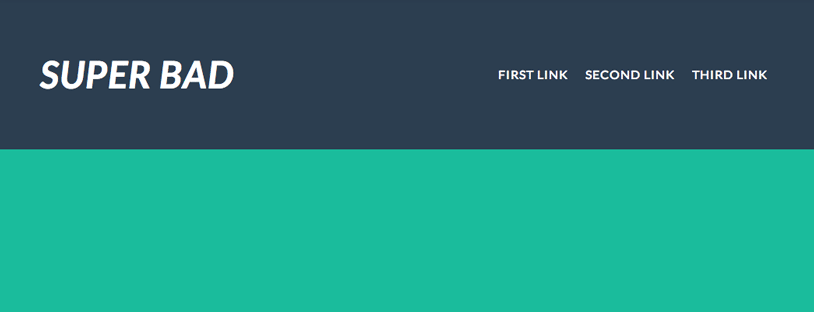
Super Bad
Высота шапки фиксированная, добавляем text-align: justify, для дочерних элементов:
Добавляем display: inline-block для всех элементов nav, чтобы можно было расположить их друг за другом:
Чтобы атрибут text-align: justify работал, как мы хотим, нужно использовать небольшой трюк с псведоэлементами, который был найден в статье Perfectly justified CSS grid technique using inline-block, автор Jelmer de Maat:

В итоге получилось выравнивание по горизонтали, без использования float и position:absolute. Теперь необходимо выравнивание элементов по вертикали. При использовании vertical-align для элементов nav будет зависимость от высоты родительского блока — шапки. А это не очень правильно. Примеры использования vertical-align: top и vertical-align: middle на jsbin. Ниже представлен возможно наиболее удобный способ вертикального выравнивания.
Используем снова псевдоэлементы. используя пример из статьи Centering in the Unknown, упомянутый Michał Czernow:
header h1 < height: 100%; >header h1::before
В результате получается то, что нужно:
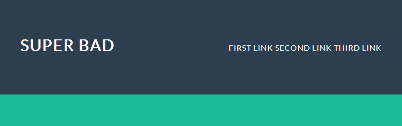
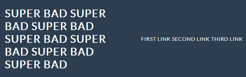
Осталось решить две задачи: корректное отображение при большом количестве текста в шапке и адаптивность. Если заголовок сайта будет слишком длинный, верстка начнет съезжать:

Используем трюк с псевдоэлементом на header:
header < text-align: justify; height: 15em; padding: 2em 5%; background: #2c3e50; color: #fff; >header::after < content: ''; display: inline-block; width: 100%; >header > div, header nav, header div h1 < display: inline-block; vertical-align: middle; >header > div < width: 50%; height: 100%; text-align: left; >header > div::before
Теперь перейдем к адаптивности. Есть несколько способов решения этой задачи, можно просто не задавать высоту шапке, и все внутренние элементы будут адаптивны высоте. При этом не потребуется второй трюк с псевдоэлементами, живой пример на jsbin.
header < text-align: justify; padding: 2em 5%; background: #2c3e50; color: #fff; >header::after < content: ''; display: inline-block; width: 100%; >header h1, header nav < display: inline-block; vertical-align: middle; >header h1 < width: 50%; text-align: left; padding-top: 0.5em; >header nav
Если же необходимо задать высоту шапки, то придется использовать и второй трюк с псевдоэлементами, и добавлять media query для экранов разных размеров:
@media screen and (max-width: 820px) < header < height: auto; >header > div, header > div h1, header nav < height: auto; width: auto; display: block; text-align: center; >> Результат адаптивен и на мобильных устройствах выглядит так:

В примере используется 820px для наглядности, на живом сайте значение конечно должно быть другое, в соответствии с требованиями. Для поддержки Internet Explorer 8 необходимо вместо “::” использовать “:” для псевдоэлементов.
@import url(http://fonts.googleapis.com/css?family=Lato:400,700italic); * < padding: 0; margin: 0; >body < background: #1abc9c; font-family: 'Lato', sans-serif; text-transform: uppercase; letter-spacing: 1px;>header < text-align: justify; height: 8em; padding: 2em 5%; background: #2c3e50; color: #fff; >header::after < content: ''; display: inline-block; width: 100%; >header > div, header > div::before, header nav, header > div h1 < display: inline-block; vertical-align: middle; text-align: left; >header > div < height: 100%; >header > div::before < content: ''; height: 100%; >header > div h1 < font-size: 3em; font-style: italic; >header nav a < padding: 0 0.6em; white-space: nowrap; >header nav a:last-child < padding-right: 0; >@media screen and (max-width: 720px) < header < height: auto; >header > div, header > div h1, header nav < height: auto; width: auto; display: block; text-align: center; >>