Technique C38: Using CSS width , max-width and flexbox to fit labels and inputs
This technique is Sufficient to meet 1.4.10: Reflow .
Applicability
This technique is applicable to Cascading Style Sheet / HTML technologies.
This technique relates to 1.4.10: Reflow (Sufficient) .
Description
The objective of this technique is to be able to present labels and inputs without introducing a horizontal scroll bar at a width equivalent to 320 CSS pixels for content intended to scroll vertically. When space is limited in the viewport for the label and input to sit next to each other horizontally, they will be changed to a vertical alignment. This is done by using CSS properties for width , max-width and flexbox that adapt to the available space.
Responsive layouts can add or remove columns or layout blocks, and each part of the layout can be wider or smaller at different points. This technique ensures labels and inputs do not break out of their layout area, including in one-column layouts where it would cause horizontal scrolling.
The basic approach for fitting labels and inputs is to:
- Define the size of layout regions using flexbox properties and media queries for specific viewport sizes, so they enlarge, shrink or wrap in the available space and respond to zoom levels;
- Position the layout regions in the flexbox container as a row of adjacent flexbox items, which may wrap to new rows as needed in much the same way as words in a paragraph wrap.
- Define the width and max-width property for labels and inputs so they enlarge or shrink in the available space and respond to zoom levels.
All labels and inputs require design finesse by making sure the original size fits the biggest size of the available spaces to achieve good-looking results at a wide range of viewport sizes and zoom levels. For help on flexbox please see the MDN article on Flexbox.
Examples
Example 1: Fitting labels, inputs and flexbox layout with HTML and CSS.
The following example uses HTML and CSS to fit labels and inputs within various width containers, including the viewport. The layout regions adjust their size as the viewport is adjusted. The labels and inputs subsequently adjust their size to fit within the layout region containers.
The zoom level can be increased to 400% without requiring horizontal scrolling. This particular example uses a percent size for the width and max-width for the labels and inputs. The max-width is applied in order to fix elements spilling out of the grid in a cross-browser way, as replaced elements such as the select have intrinsic sizing.
/* Fitting Inputs Styling */ .form-group < display: flex; flex-flow: row wrap; margin: 0 -1rem 1rem -1rem; >[class*="form-col"] < flex: 0 1 100%; padding: 0 1rem; >@media (min-width: 576px) < .form-col-4 < flex: 0 0 33.33333%; max-width: 33.33333%; >.form-col-8 < flex: 0 0 66.66667%; max-width: 66.66667%; >.offset-form-col-4 < margin-left: 33.33333%; >> input < display: block; width: 100%; >label, select Tests
Procedure
- Display the web page in a user agent capable of 400% zoom and set the viewport dimensions (in CSS pixels) to 1280 wide and 1024 high.
- Zoom in by 400%.
- For vertically scrolling content, all labels and inputs fit in their available space without horizontal scrolling.
NB: If the browser is not capable of zooming to 400%, you can reduce the width of the browser proportionally. For example, at 300% zoom the viewport should be sized to 960px wide.
Expected Results
Help improve this page
Please share your ideas, suggestions, or comments via e-mail to the publicly-archived list group-ag-chairs@w3.org or via GitHub
Date: Updated 20 June 2023.
Developed by Accessibility Guidelines Working Group (AG WG) Participants (Co-Chairs: Alastair Campbell, Charles Adams, Rachael Bradley Montgomery. W3C Staff Contact: Michael Cooper).
The content was developed as part of the WAI-Core projects funded by U.S. Federal funds. The user interface was designed by the Education and Outreach Working Group (EOWG) with contributions from Shadi Abou-Zahra, Steve Lee, and Shawn Lawton Henry as part of the WAI-Guide project, co-funded by the European Commission.
Strategies, standards, and supporting resources to make the Web accessible to people with disabilities.
Copyright © 2023 World Wide Web Consortium (W3C ® ). See Permission to Use WAI Material.
Position Text Labels on Forms Using CSS
In this post, I’ll explain three common approaches to positioning text labels on web forms using CSS:
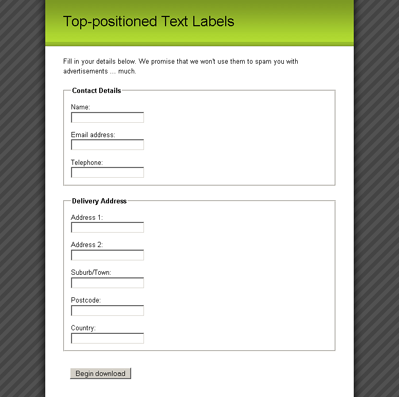
Using Top-positioned Text Labels
Positioning labels at the top of their form elements is probably the easiest layout to achieve, as we only need to tell the label to take up the entire width of its parent element.
As our form elements/labels are inside ordered list items (which are block elements), each pair will naturally fall onto a new line, as you can see from Figure 9. All we have to do is get the form elements and labels onto different lines.
This exercise is easily completed by turning the label elements into block elements, so that they’ll occupy an entire line:
It’s a simple change, but one which makes the form much neater, as shown below.

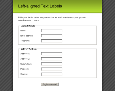
Left-aligning Text Labels
When we create a column of text labels to the left of the form elements, we’ll have to do a little bit more work than just to position them at the top. Once we begin floating elements, all hell breaks loose!
In order to position the labels next to the form elements, we float the label elements to the left and give them an explicit width :
label float: left;
width: 10em;
margin-right: 1em;
>
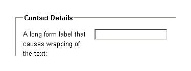
We also apply a little bit of margin-right to each label , so that the text of the label can never push right up next to the form element. We must define an explicit width on the floated element so that all the form elements will line up in a neat vertical column. The exact width we apply will depend upon the length of the form labels. If possible, the longest form label should be accommodated without wrapping, but there shouldn’t be such a large gap that the smallest label looks like it’s unconnected to its form element. In the latter scenario, it is okay to have a label width that is smaller than the longest label , because the text will wrap naturally anyway, as you can see below.

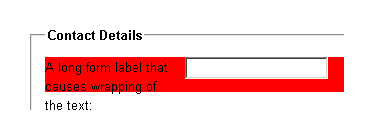
Once we float the label , however, we run into a problem with its containing list item — the list item will not expand to match the height of the floated element. This problem is highly visible in the image below, where we’ve applied a background-color to the list item.
One markup-free solution to ensuring a parent contains any of its floated children is to also float the parent, so that’s what we’ll do:
left-aligned-labels.css (excerpt)
fieldset li float: left;
clear: left;
width: 100%;
padding-bottom: 1em;
>
If the list item is floated, it’ll contain all of its floated children, but its width must then be set to 100% , because floated elements try to contract to the smallest width possible. Setting the width of the list item to 100% means that it’ll still behave as if it were an unfloated block element. We also throw a clear :left property declaration in there to make sure that we won’t find any unwanted floating of list items around form elements. clear: left means that the list item will always appear beneath any prior left-floated elements instead of beside them.
However, once we float the list item, we find the same unwanted behavior on the fieldset — it won’t expand to encompass the floated list items. So, we have to float the fieldset . This is the main reason that we removed the padding from fieldset earlier — when we set its width to 100% , any padding will throw out our dimensions:
left-aligned-labels.css (excerpt)
fieldset float: left;
clear: left;
width: 100%;
margin: 0 0 1.5em 0;
padding: 0;
>
Where will this float madness end? Remain calm. It ends right here, with the submit fieldset . Since it’s the last fieldset in the form, and because it doesn’t need as much special CSS styling as the other fieldset s, we can turn off that floating behavior for good:
left-aligned-labels.css (excerpt)
fieldset.submit float: none;
width: auto;
border: 0 none #FFF;
padding-left: 12em;
>
By turning off floating and setting the width back to auto , the final submit fieldset becomes a normal block element that clears all the other floats. This means the form will grow to encompass all the fieldset elements, and we’re back in the normal flow of the document.
None of the elements in the submit fieldset are floated, but we want the button to line up with all of the other form elements. To achieve this outcome, we apply padding to the fieldset itself, and this action pushes the submit button across to line up with all the text fields. It’s best to have the button line up with the form elements, because it forms a direct linear path that the user’s eye can follow when he or she is completing the form.
After all that floating, we now have the layout shown below — a form with a column for the form labels and a column for the form elements.

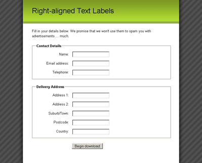
Right-aligning Text Labels
With all that difficult floating safely out of the way, aligning the input labels to the right is a breeze; simply set the text alignment on the label elements to achieve a form that looks like the image below:
right-aligned-labels.css (excerpt)
label float: left;
width: 10em;
margin-right: 1em;
text-align: right;
>

And we’re done! Now you can take your pick of whichever form layout best fits your pages, all by changing a little CSS!
Which option do you prefer, and why? Let us know in the comments.
Элемент label
Элемент связывает текст с определённым элементом формы. Обычно применяется в следующих случаях.
- Текст становится активным и при щелчке по нему изменяется значение связанного с текстом переключателя или флажка. Это удобно для пользователя, потому что не приходится целиться курсором в небольшой по размерам элемент.
- Стили для позволяют задать положение текста и другие характеристики оформления.
Простой вариант использования заключается в добавлении полей формы прямо внутрь с желаемым текстом, как показано в примере 1.
Визуально себя никак не проявляет, поэтому понять, задействован он или нет, можно только по тексту. Если щелчок по тексту переносит фокус в текстовое поле, ставит галочку в переключателе или ещё как-то активирует близлежащий элемент формы, значит работает .
Поля формы и текст для них могут визуально находиться рядом, но в коде документа располагаться внутри разных элементов. Чтобы связать их между собой применяется атрибут for , его значением выступает идентификатор у , как показано в примере 2.
Для каждого элемента задаём свой уникальный идентификатор через атрибут id , а внутри элемента указываем этот же идентификатор как значение атрибута for .
Также применяется как один из элементов для вёрстки сложных форм. В примере 3 показана форма авторизации, в которой текст располагается рядом с полями для ввода логина и пароля.
Пример 3. Форма для авторизации
Результат данного примера показан на рис. 1.

Рис. 1. Форма для авторизации пользователя
См. также
- Аккордеон меню
- Вкладки на CSS
- Выпадающее меню
- Использование :checked
- Подсказка в поле формы
- Пользовательские формы
- Стилизация переключателей
- Стилизация флажков
- Формы в Bootstrap 4
- Формы в HTML