Elevate Your Design: Smooth Cornering using CSS
In this post, we will be discussing how to create smooth corners on elements in your website or application, similar to how it can be done in design tools like Figma. Achieving a polished, professional look is crucial for any website or application, and smooth corners can be a key element in achieving that look. Whether you’re a designer or a developer, this guide will show you how to create smooth corners using CSS and take your designs to the next level. So let’s get started! CSS provides several properties that allow developers to easily create rounded edges, including the border-radius property. However, sometimes this property may not give you the smooth border radius effect that you desire. That’s where the mask property comes in. The mask property in CSS allows developers to control the transparency of an element by specifying a mask image, which can be a solid color, a gradient, or an image. In this blog post, we’ll be discussing how to use the mask property to create a smooth border radius effect. HTML:
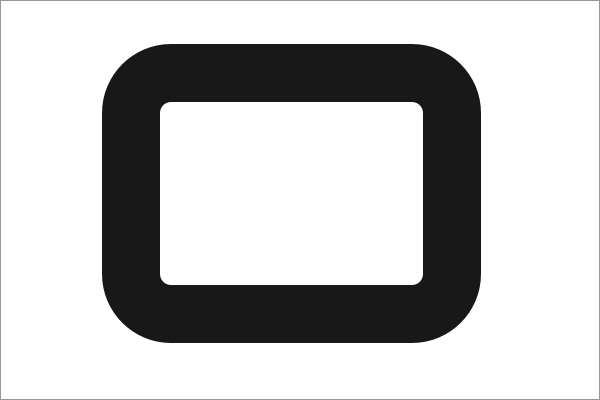
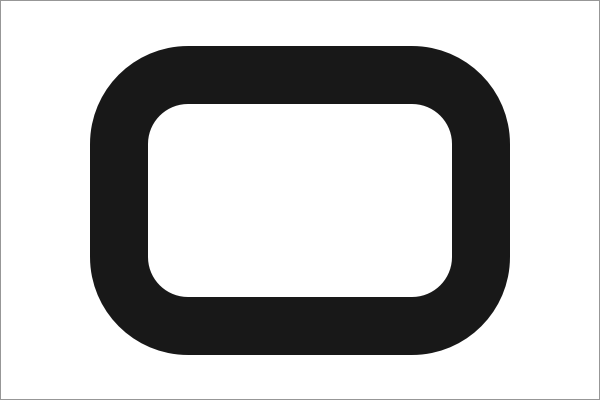
Here, we are using CSS’s mask property to create a smooth «squircle» shape for an image. The HTML code sets the image source and adds the class «mask mask-squircle» to the img tag. The CSS code first sets some general properties for the mask class, such as the size, repeat, and position of the mask. These properties ensure that the mask is contained within the image, is not repeated, and is centered on the image. Then, we create a new class called mask-squircle which applies the actual squircle mask to the image. The mask is defined as an SVG path with a specific encoding, and is applied to the image using the -webkit-mask-image and mask-image properties. As a result of this code, the image will be displayed with a smooth squircle shape, thanks to the use of the mask property. Note that this code uses vendor prefixes for webkit browsers, so it will work well across most modern browsers. It’s also worth noting that the mask property is not supported in all browsers, so it’s important to use a fallback for unsupported browsers. One such fallback is the clip-path property, which works in a similar way to the mask property and can be used to create rounded edges and shapes. To use the clip-path property as a fallback for the mask property, you can add the following code:
This will ensure that the image is displayed with a smooth squircle shape even on browsers that don’t support the mask property. DEMO In conclusion, the mask property is a powerful tool that can be used to create a smooth border radius effect in CSS. With a little experimentation and some creative thinking, you can use the mask property to create visually appealing websites that stand out from the rest. Be sure to use a fallback such as the clip-path property for browsers that do not support the mask property.
Smooth corners with CSS Houdini
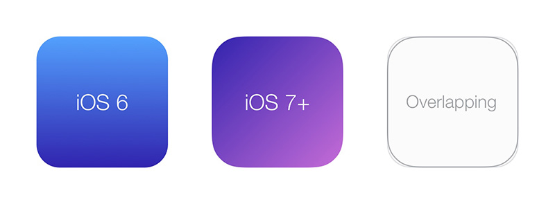
Recently, I’ve shared on Twitter an article about optical illusions in user interfaces. I love illusions, but that’s a new one to me: a modified circle can look more circular than a geometric one! And this is also true for rounded rectangles. Surprisingly enough, I also discovered that Apple is using this trick for all their icons since iOS7. Mathematically, it’s known as the Lamé Curve or Superellipse.
At the same time, I was experimenting with the Paint API from Houdini for a talk. This API defines a new way to draw content into a CSS during the paint phase of the rendering engine. It basically gives the ability to programmatically draw an image to be used as a background for example. So, drawing a superellipse should be easy.
Few weeks later, Sketch released a new version and introduced “Smooth corners” feature which is, as far as I know, a superellipse. But I love the name, so let’s create smooth corners in CSS.
First, let’s add a new paintWorklet module 1
(CSS.paintWorklet || paintWorklet).addModule('smooth-corners.js')Then, from this new loaded file, register a new paint called smooth-corners , with a paint method which is drawing a superellipse (algorithm from QT codebase):
registerPaint('smooth-corners', class < paint(ctx, size) < ctx.fillStyle = 'black' // n=4 draw a squircle const n = 4 let m = n if (n >100) m = 100 if (n < 0.00000000001) m = 0.00000000001 const r = size.width / 2 const w = size.width / 2 const h = size.height / 2 ctx.beginPath(); for (let i = 0; i < (2*r+1); i++) < const x = (i-r) + w const y = (Math.pow(Math.abs(Math.pow(r,m)-Math.pow(Math.abs(i-r),m)),1/m)) + h if (i == 0) ctx.moveTo(x, y) else ctx.lineTo(x, y) >for (let i = (2*r); i < (4*r+1); i++) < const x = (3*r-i) + w const y = (-Math.pow(Math.abs(Math.pow(r,m)-Math.pow(Math.abs(3*r-i),m)),1/m)) + h ctx.lineTo(x, y) >ctx.closePath() ctx.fill() > >)Speaking about arguments of the paint method:
- ctx is a PaintRenderingContext2D object, which is a subset of CanvasRenderingContext2D , so you can (mostly) draw anything you want
- size is a PaintSize object which is the size of the image to be drawn
Now, we can use it from CSS with the new paint() function. It will draw a black rounded rectangle with smooth corners
To keep things simple, we will use the generated image as a CSS mask 2 . That way, we can easily set background for colors, gradients or images.

That’s nice, but not very reliable. Right now, we draw a specific superellipse named a squircle 3 , because the n variable is set to 4 . So, how do we draw a superellipse with a different exponent? iOS icons use 5 for example. Let’s do it with CSS custom properties.
First, use a custom property —smooth-corners
And get value from registerPaint function
registerPaint('smooth-corners', class < static get inputProperties() < return [ '--smooth-corners' ] >paint(ctx, size, styleMap) < const exp = styleMap.get('--smooth-corners').toString() const n = exp >>)Note that the paint() method receives a third argument styleMap , which is an API to retreive computed value’s for properties listed in inputProperties . Here we get —smooth-corners value and use it for the n variable.
The full power now is that we can author —smooth-corners right from CSS, and property could even be animated if we register it using CSS.registerProperty (from CSS Houdini Properties & Values API).
For now, only Chrome 4 supports the Paint API from Houdini, so we do progressive enhancement:
.el < border-radius: 60px; background: linear-gradient(. ) >@supports (mask-image: paint(smooth-corners)) < .el.is-loaded < border-radius: 0; mask-image: paint(smooth-corners); --smooth-corners: 5; >>Also, as Houdini is JS-in-CSS, it’s better to wait for JavaScript to be loaded or ready. Here, I decided to add .is-loaded class to the element.
In production, we should be able to automate authored CSS with a PostCSS plugin for example.
Play with it IRL https://css-houdini.rocks/smooth-corners in a supported browser
Notes
Using a CSS mask basically masks everything outside of the box (it’s the purpose of a mask 😁). You should be able to draw a gradient or an image from the registerPaint if you need to (but it seems that type is not yet well supported, so you have to deal with it for now).
If you want to experiment a bit, see other demos on how to draw an image: create your own background properties, like background-opacity or how to pass arguments instead of properties: draw a gradient from 4 corners. I will be happy to share your work!
- Chrome with flag. PaintWorklet is either on CSS (Canary) or window (stable) ↩
- Don’t forget to use Autoprefixer for specific WebKit prefixes ↩
- A mix between the words “square” and “circle” ↩
- For developers, with experimental Web platform flag enabled ↩
If this article helps you Buy me a coffee!

Vincent De Oliveira (aka iamvdo)
Hello! I love the web and the open-source, co-author of a french CSS3 book.
Hand-made with ♥ , Greeed, Heeere and Kirby. 2014 — 2023
How To Get Smoother Rounded Corners
Border-radius — don’t ya just love it? It’s easily over-used, but done nicely and not too often, rounded corners can add a touch of class to pretty-much anything.
However certain color combinations can produce a somewhat jagged effect, even with the anti-aliasing that all browsers apply. In my experience, the offender is dark backgrounds with lighter borders, particularly against off-white backgrounds, and is particularly pronounced in Safari, though it’s there in all browsers.
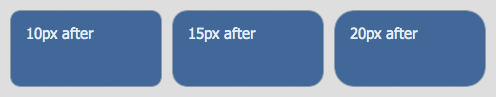
Here’s an image taken with Safari, that illustrates this with three different border radii:

Looks pretty good, but you can clearly see a slightly jagged effect to each corner. Now here’s those boxes again, this time with smoother corners:
And the difference? Simply split the colors between different elements — the outer element has the border and the specified border-radius, while the inner element has the background-color and a slightly smaller border-radius.
It’s a simple trick, and not a huge difference, but there definitely is a difference and a clear improvement, as you can see. I’m not entirely sure why it makes a difference, but I imagine it’s because of the way the anti-aliasing algorithms are applied; because each algorithm only deals with one color instead of two, or the way the now-separate anti-aliasings merge together; something.
If you’d like to poke around those examples in more detail, here are the live demos from which those screenshots were taken. But you can also see it right on this page — the categories tabs at the top, and the boxes down the right with dark-blue headers, all use this technique. I developed it while building these templates, because the jaggedness was bugging me!
And now they’re smooth as the proverbial baby’s bottom!
Share This Article
James is a freelance web developer based in the UK, specialising in JavaScript application development and building accessible websites. With more than a decade’s professional experience, he is a published author, a frequent blogger and speaker, and an outspoken advocate of standards-based development.
How to adjust the element’s inner border radius
An element’s inner border-radius is the value a developer cannot directly affect. However, some tricks can be implemented in order to achieve the same smooth border curve result.
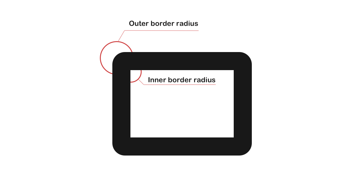
The element’s inner border-radius is formed via formula:
IBR: Inner Border Radius OBR: Outer Border Radius BW: Border Width IBR = OBR - BW The padding edge (inner border) radius is the outer border radius minus the corresponding border thickness.
— Corner Shaping
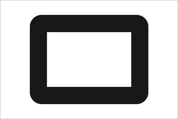
Therefore there might be cases when the inner border-radius will differ from the outer one. Usually, this will happen when the border-width is greater than the border-radius , this will result in a right angle.
Luckily if you know how the inner border-radius is formed, you can apply certain changes that will help you to smooth out the looks of the inner border-radius.
There are a few ways to achieve that. Let’s say there’s an element with some content inside it.
class="content"> Lorem ipsum dolor sit amet consectetur adipisicing elit. .content border: 13px solid #333; border-radius: 10px; > 1. Add a box-shadow property
For this trick, the border property must be removed and box-shadow must be added instead.
class="content"> Lorem ipsum dolor sit amet consectetur adipisicing elit. .content box-shadow: 0 0 0 13px #333; border-radius: 10px; > NOTE: box-shadow property goes outside the element’s box model, this means that the element might get larger in size.
2. Add a container for content
Although the box-shadow gets the job done it is a bit hacky fix. Another more proper way to fix it is to add a wrapper for the content and set the border-radius property for it. The value should be equal to a CSS calc() function. The parameter for this function should be the expression based on the formula given above.
To actually make the inner border-radius effect a background property with a value equal to the border color must be set to the .content element.
For the p element, a background property must be set as well.
class="content"> Lorem ipsum dolor sit amet consectetur adipisicing elit. .content border: 13px solid #333; border-radius: 10px; background: #333; > .content p border-radius: calc(13px - 10px); background: #fff; margin: 0; > Lorem ipsum dolor sit amet consectetur adipisicing elit.
What about gradient?
If you wish to use a gradient for your border then you should set a background property for the .content with linear-gradient as the border-color and the padding property as the border-width .
.content border-radius: 10px; background: linear-gradient(45deg, purple, orange); padding: 10px; > .content p border-radius: calc(13px - 10px); background: #fff; margin: 0; > Lorem ipsum dolor sit amet consectetur adipisicing elit.