- Create a slider with pure CSS
- Step 1 — create your slider layout
- Step 2 — Adding the slider navigation buttons
- Step 3 — Removing the scrollbar with CSS
- Step 4 — Fixing the navigation buttons in place
- Step 5 — Add breadcrumbs to the slider
- Conclusion
- Related articles
- Top 5: Best before and after (image comparison) slider jQuery and Javascript plugins
- 5. Cocoen
- 4. imgSlider
- 3. Juxtapose
- 2. Before-after.js
- 1. Twenty Twenty
- Honorable mentions
- Beerslider
Create a slider with pure CSS
Actually, there is a clever way to do this with pure CSS, and not a single line of JS. And yes, that includes navigation buttons and breadcrumbs!
Take a quick look at the result we will get:
Step 1 — create your slider layout
First you need to create a space for your slider to go into, and of course, some slides!
div class="slider-container">
div class="slider">
div class="slides">
div id="slides__1" class="slide">
span class="slide__text">1span>
div>
div id="slides__2" class="slide">
span class="slide__text">2span>
div>
div id="slides__3" class="slide">
span class="slide__text">3span>
div>
div id="slides__4" class="slide">
span class="slide__text">4span>
div>
div>
div>
div>- slider-container is just the element on your site that you want the slider to go in.
- slider is like the ‘screen’, or the viewport that will display all your slides.
- slides will hold your slides. This is the element that actually scrolls to give the slider effect.
- slide is each individual slide. Note that you need the slide class, and a unique id for each one.
.slider-container
background: linear-gradient(149deg, rgb(247, 0, 255) 0%, rgb(255, 145, 0) 100%);
display: flex;
align-items: center;
justify-content: center;
height: 100%;
>

.slider
width: 100%;
max-width: 600px;
height: 400px;
margin: 20px;
text-align: center;
border-radius: 20px;
position: relative;
>
slider-container can be anything — I’ve just used a flexbox to make it easy to centre the slider. But if you prefer, you can use CSS Grid (it’s a question of preferences, as we explained in this CSS Grid Vs. Flexbox article)
slider just sets the size of your slider — you can adjust this to suit your needs.
Next, we’ll style the slides element:
.slides
display: flex;
overflow-x: scroll;
position: relative;
scroll-behavior: smooth;
scroll-snap-type: x mandatory;
>
OK, this is where the magic happens. If we set overflow-x to scroll, anything that doesn’t fit in our slider viewport will be accessible only by scrolling.
Setting scroll-behavior to smooth and scroll-snap-type to x mandatory means that if we jump-link to any child element of slides , the browser will scroll to it smoothly, rather than just jumping immediately to that element.
Right, next let’s style the slides themselves:
.slide:nth-of-type(even)
background-color: rgb(250, 246, 212);
>

.slide
display: flex;
justify-content: center;
align-items: center;
flex-shrink: 0;
width: 100%;
height: 400px;
margin-right: 0px;
box-sizing: border-box;
background: white;
transform-origin: center center;
transform: scale(1);
scroll-snap-align: center;
>

.slide__text
font-size: 40px;
font-weight: bold;
font-family: sans-serif;
>
Match the size of slide to be the same as slider . The final three properties, transform-origin , transform , and scroll-snap-align , are key. These ensure that when we jump-link to any particular slide, the slide will ‘snap’ into the middle of the slider viewport.
If you click inside the slider, then press the arrow keys, you’ll see the smooth scrolling and snapping behaviour in action.
But of course we don’t want our users to have to do this! We want to put some navigation buttons on the slider instead — and we should probably get rid of that scrollbar too!
Step 2 — Adding the slider navigation buttons
In the HTML, I’ve added two a elements to each slide:
div class="slider-container">
div class="slider">
div class="slides">
div id="slides__1" class="slide">
span class="slide__text">1span>
a class="slide__prev" href="#slides__4" title="Next">a>
a class="slide__next" href="#slides__2" title="Next">a>
div>
div id="slides__2" class="slide">
span class="slide__text">2span>
a class="slide__prev" href="#slides__1" title="Prev">a>
a class="slide__next" href="#slides__3" title="Next">a>
div>
div id="slides__3" class="slide">
span class="slide__text">3span>
a class="slide__prev" href="#slides__2" title="Prev">a>
a class="slide__next" href="#slides__4" title="Next">a>
div>
div id="slides__4" class="slide">
span class="slide__text">4span>
a class="slide__prev" href="#slides__3" title="Prev">a>
a class="slide__next" href="#slides__1" title="Prev">a>
div>
div>
div>
div>- The one going backwards has the slide__prev class, and the one going forwards has the slide__next class.
- the href contains the jump link to the slide we want to move to. You have to set these manually.
.slide a
position: absolute;
top: 48%;
width: 35px;
height: 35px;
border: solid black;
border-width: 0 4px 4px 0;
padding: 3px;
box-sizing: border-box;
>

a.slide__prev
transform: rotate(135deg);
-webkit-transform: rotate(135deg);
left: 5%;
>

a.slide__next
transform: rotate(-45deg);
-webkit-transform: rotate(-45deg);
right: 5%;
>
You can style and position these buttons however you want — I’ve chosen to have arrows pointing in each direction. Sometimes the simple option is the best — but you can make your own choice!
Step 3 — Removing the scrollbar with CSS
.slider
width: 600px;
height: 400px;
text-align: center;
border-radius: 20px;
overflow: hidden;
position: relative;
>
. just add overflow: hidden; to .slider . This also bring the border radius into play.
OK, pretty good — but ideally we don’t want the buttons to be locked to each slide. Sliders typically have buttons fixed in place.
But is that possible with CSS?
Step 4 — Fixing the navigation buttons in place
We don’t need to change the HTML for this, but we do need to update our CSS a bit:
.slide a
background: none;
border: none;
>

a.slide__prev,
.slider::before
transform: rotate(135deg);
-webkit-transform: rotate(135deg);
left: 5%;
>

a.slide__next,
.slider::after
transform: rotate(-45deg);
-webkit-transform: rotate(-45deg);
right: 5%;
>

.slider::before,
.slider::after,
.slide__prev,
.slide__next
position: absolute;
top: 48%;
width: 35px;
height: 35px;
border: solid black;
border-width: 0 4px 4px 0;
padding: 3px;
box-sizing: border-box;
>

.slider::before,
.slider::after
content: '';
z-index: 1;
background: none;
pointer-events: none;
>
OK so what’s going on here? Well first, we’ve taken the background and border off of the a element. This makes our buttons effectively invisible.
Then, we’ve added before and after pseudo elements to slider . These have the same style that we previously had on the a elements — the nice simple arrow. And we’ve positioned them exactly on top of our now invisible buttons, and set pointer-events to none .
Because they are attached to the slider element and not slide , they will remain fixed in place as the user scrolls through the slides. But. when the user clicks on one, they are actually clicking on the invisible button attached to the actual slide.
This gives the illusion of fixed navigation buttons! Nice eh?
OK, now we’ve got a pretty good, pure CSS slider!
Aha, I hear you say, but what about breadcrumbs, can we add those too?
Glad you asked — yes we can!
Step 5 — Add breadcrumbs to the slider
To add the breadcrumbs to the slider, we are really using the same techniques we’ve just been through — just in a slightly different way.
Each breadcrumb will just be another jump link pointing to the relevant slide, and we’ll position it absolutely in the slider element.
So here’s the HTML (put this in slider , below the slides element):
div class="slider__nav">
a class="slider__navlink" href="#slides__1">a>
a class="slider__navlink" href="#slides__2">a>
a class="slider__navlink" href="#slides__3">a>
a class="slider__navlink" href="#slides__4">a>
div>
See? Same links as we used before. Now to style it:
.slider__nav
box-sizing: border-box;
position: absolute;
bottom: 5%;
left: 50%;
width: 200px;
margin-left: -100px;
text-align: center;
>

.slider__navlink
display: inline-block;
height: 15px;
width: 15px;
border-radius: 50%;
background-color: black;
margin: 0 10px 0 10px;
>
Again, you are free to style these however your heart desires!
And here is the final result:
A pretty cool slider, and no JavaScript in sight. Hope that’s useful to you!
Conclusion
This is a useful trick that lets you create slider functionality — even for people with JS turned off. But of course, without JS, you’re really limited in what you’re able to do and how you can integrate it with your existing site.
If you wanted to harness the power of JS to create beautiful, responsive, full-page sliders, check out fullPage.js. It’s got slider functionality right out of the box, and includes support for:
- Breadcrumb navigation — which you can move around and style easily
- Autoplay — so your visitors get to see more of your awesome content even if they don’t click the navigation buttons!
- Lazy loading — speed up your site by only loading assets when needed
- Lots, lots more
It’s also super-easy to set up — so give it a try!
And if you still hungry for sliders, get inspired by this list of amazing animated sliders or this another one with cool Webflow sliders.
Related articles
Warren Davies is a front end developer based in the UK.
You can find more from him at https://warrendavies.net
Join 2,000+ readers and learn something new every month!
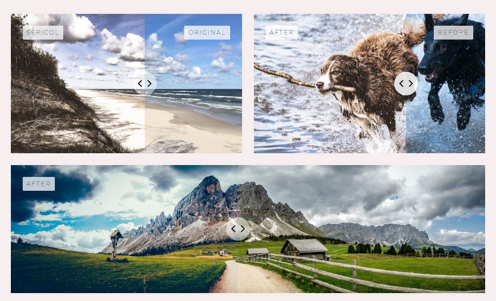
Top 5: Best before and after (image comparison) slider jQuery and Javascript plugins

See our recopilation from 5 of the best image comparison slider plugins for web applications.

Everything come through the eyes, whatever the topic is (specifically talking about images) the best (nice, beautiful) impression of something, will be always the election of an user. The ability to allow the user to view a comparison between 2 images and control it by himself can be a fascinating experience for the user and advantageous for you. Notably, we are not talking only about timelines (before and after), but for comparison between your product and others (independently of if they’re similar or not).
As always mentioned in our Tops, do not build the wheel as it already exists, that costs money, time and mental health (yep, it could be difficult to achieve if you are starting from the ground). In this top, we’ve collected 7 of the most imponent comparison between images plugins for Javascript and jQuery, so you won’t waste too much time looking for plugins and you’ll start working immediately on your project. Enjoy it !
5. Cocoen
Cocoen is a touch-enabled before/after slider jQuery plugin with requestAnimationFrame. This plugin is based in Before-after.js
4. imgSlider
A simple jquery plugin for creating image comparison sliders.

3. Juxtapose
Juxtapose is a JavaScript library for making a before/after image slider. JuxtaposeJS helps storytellers compare two pieces of similar media, including photos, and GIFs. It’s ideal for highlighting then/now stories that explain slow changes over time (growth of a city skyline, regrowth of a forest, etc.) or before/after stories that show the impact of single dramatic events (natural disasters, protests, wars, etc.). It is free, easy to use, and works on all devices. All you need to get started are links to the images you’d like to compare.

You can use it in horizontal or even in vertical mode.
2. Before-after.js
Before-after.js is simple and responsive image comparison slider. Although the idea of a before-after slider is nothing new and although there are even pure CSS implementations that is nothing but short of amazing. Before-after.js is very simple and will probably fit with all your needs.
1. Twenty Twenty
Developers tend to typically place two images next to each other in hopes that the user will see clearly and exactly what changed. But there’s a better way to highlight the differences between two images, a way that would bring everything into focus.
That’s the point of Twenty Twenty, this jQuery plugin is a visual diff tool, that makes it easy to spot differences between 2 images for the user through a slider item.

Honorable mentions
Beerslider
Beerslider is a vanilla JavaScript accessible before-after slider. It’s basic purpose is to compare two versions of an image, for example the same object shot in two different moments, a pre-edited photo and its processed version, a sketch and the finished illustration, etc. It can be particularly useful with photo presets (Lightroom presets, Photoshop actions, etc.). Beer Slider is keyboard accessible — you can access it and reveal/hide the «after» state image with the keyboard.
If you know another awesome plugin to compare images (before and after), please share it with the community in the comment box.
Carlos Delgado
Senior Software Engineer at EPAM Anywhere. Interested in programming since he was 14 years old, Carlos is a self-taught programmer and founder and author of most of the articles at Our Code World.