- Шпаргалка по всем свойствам CSS Flexbox
- Что такое Flexbox
- Архитектура Flexbox
- Список свойств Flexbox
- Создаём проект
- HTML
- CSS
- Свойство flex-direction
- Свойство justify-content
- Свойство align-content
- Свойство align-items
- Свойство align-self
- Свойства flex-grow, shrink, wrap и basis
- Flex-grow
- Flex-shrink
- Flex-wrap
- Flex-basis
- Как читать сокращения свойств Flexbox
- Сокращение flex
- Сокращение flex-flow
- Сокращение place-content
- CSS Flexbox Tutorial with Flexbox Properties Cheat Sheet 🎖️
- Table of Contents
- You can watch this tutorial on YouTube as well if you like:
- Flexbox Architecture
- Flexbox Chart
- How to Set Up the Project
- HTML
- CSS
- But Wait.
- flex-direction property
- justify-content property
- align-content property
- align-items property
- align-self property
- Take a Break
- flex — grow | shrink | wrap | basis properties
- flex-grow
- flex-shrink
- flex-wrap
- flex-basis
- Shorthand Flexbox Properties
- flex shorthand
- flex-flow
- place-content
- More Resources
- Conclusion
- Suggestions & Criticisms Are Highly Appreciated ❤️
Шпаргалка по всем свойствам CSS Flexbox

В этой статье мы рассмотрим основы CSS Flexbox, чтобы вы могли создавать адаптивные сайты.
Объясним, как работает каждое из свойств Flexbox, и дадим вам шпаргалку к каждому свойству. В шпаргалках описано всё, что можно сделать с помощью Flexbox.
Это — перевод оригинальной статьи на freeCodeCamp от автора Joy Shaheb.
Ещё у нас есть видеоверсия урока от автора (осторожно, английский язык):

Что такое Flexbox
Когда вы строите дом, вам нужен чертеж. Точно такой же чертеж нам понадобится для создания веб-сайтов. И Flexbox — это тот самый чертеж.
Flexbox позволяет нам компоновать между собой содержимое нашего сайта. Ещё она помогает создавать адаптивные структуры для веб-сайтов под различные устройства.
Вот демо-визитка, написанная на Flexbox в качестве чертежа.

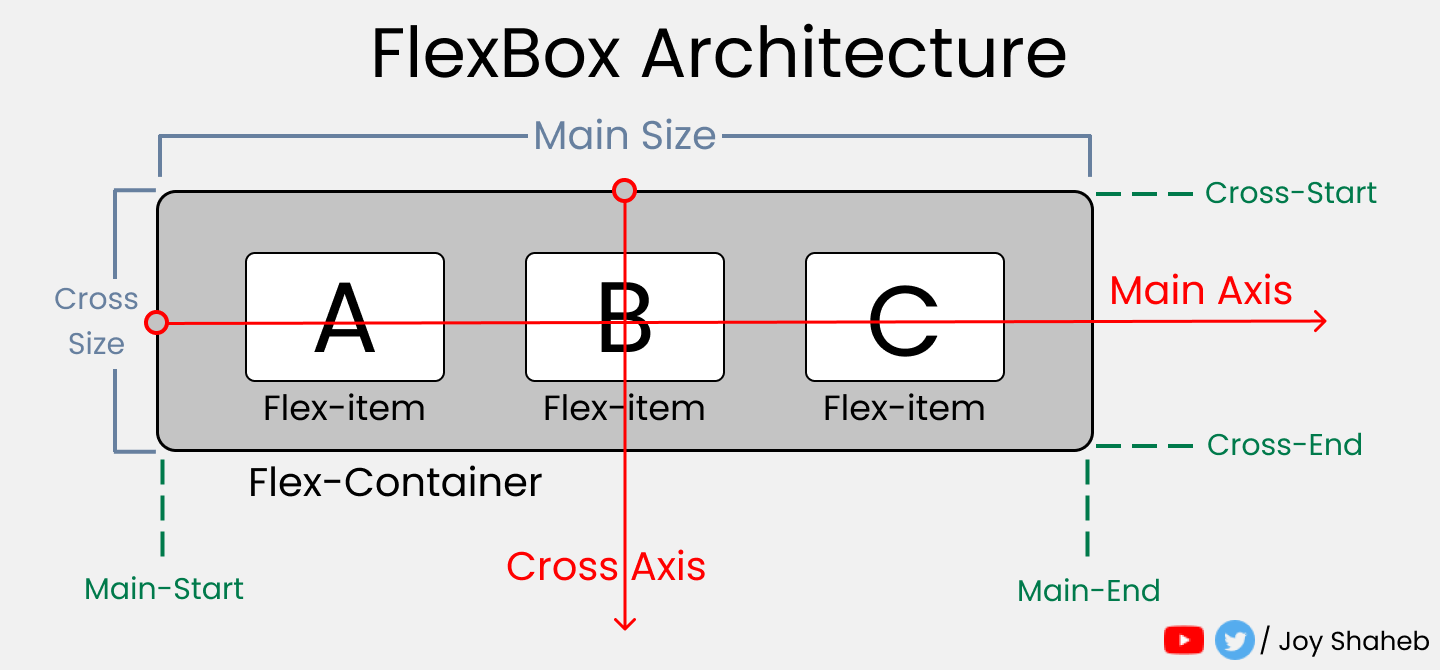
Архитектура Flexbox
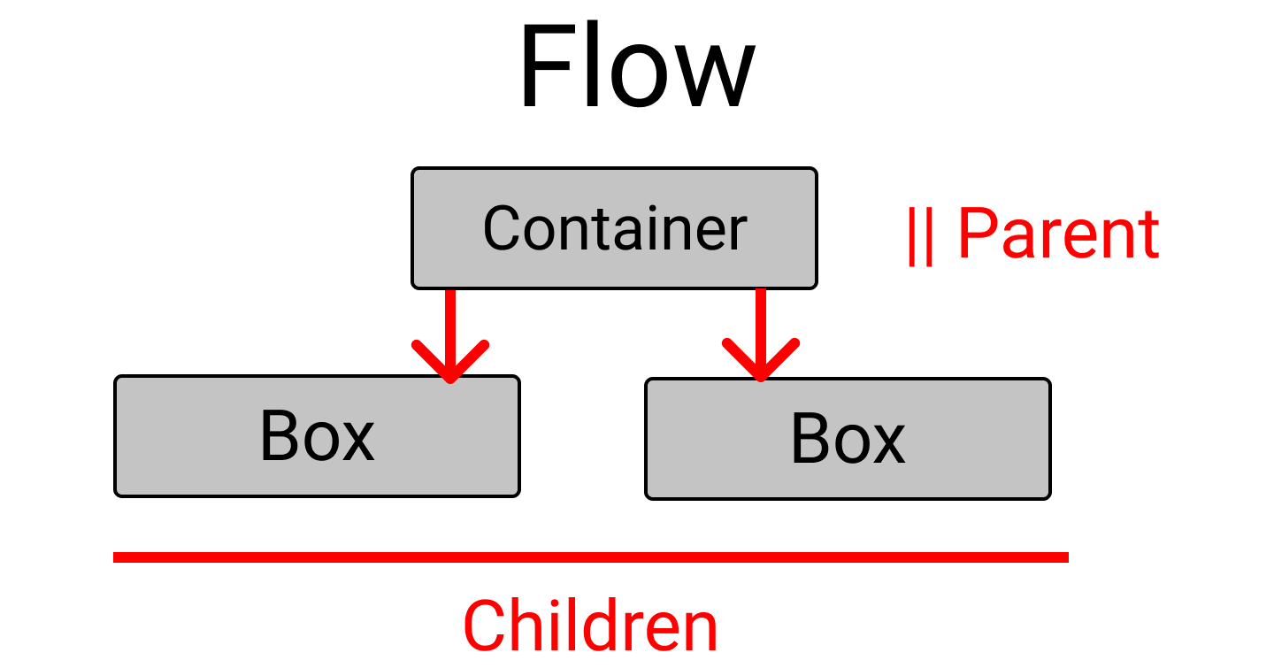
Как же работает архитектура Flexbox? Контентные flex-элементы распределяются вдоль главной оси и поперечной оси, как в системе координат.
И, в зависимости от значений flex-direction, положение блоков меняется между строками и колонками.

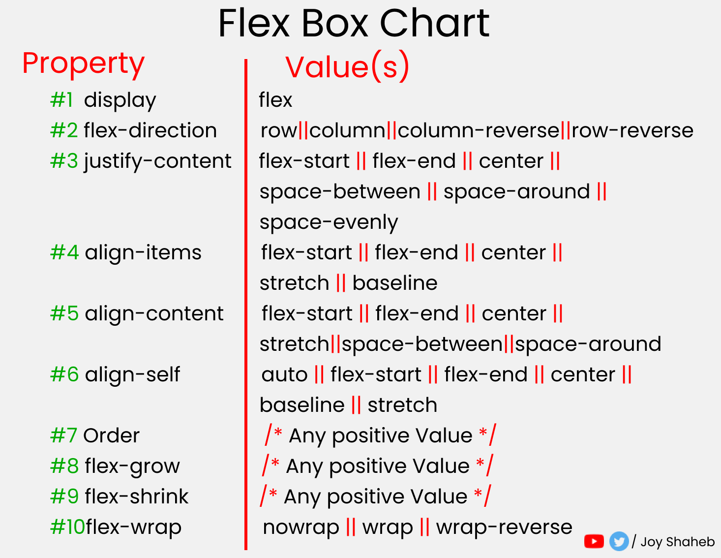
Список свойств Flexbox
Этот список содержит все возможные свойства и значения, которые вы можете использовать при работе с Flexbox.
Вы можете использовать список при выполнении проектов и экспериментировать с различными значениями.

Создаём проект
Чтобы создать проект с Flexbox, нужно немного знать HTML, CSS и работу с VS-кодом. Вот, что вам нужно сделать:
- Создайте папку с именем «Project-1» и откройте VS Code.
- Создайте файлы index.html и style.css.
- Установите Live Server и запустите его.
Или вы можете просто открыть Codepen и начать кодить.
HTML
В HTML напишите эти строки кода внутри тега body
CSS
Создайте класс .container и укажите в нём поля. Затем оформите блоки так, чтобы все они выглядели одинаково, как в примере ниже. .
Примечание: не забудьте указать высоту контейнера.
Также, прежде чем начать, необходимо понять отношения между родительскими и дочерними классами.
Flexbox работает только с родительским классом, но не с дочерними классами.
Здесь класс .container является родительским, а классы .box-* — дочерними.
Поэтому примените display: flex внутри класса .container . Расположите текст по центру блока.
И… все готово! Теперь мы готовы кодить. .
Свойство flex-direction
Это свойство позволяет нам задавать направление и ориентацию, согласно которым flex-элементы должны располагаться внутри flex-контейнера.
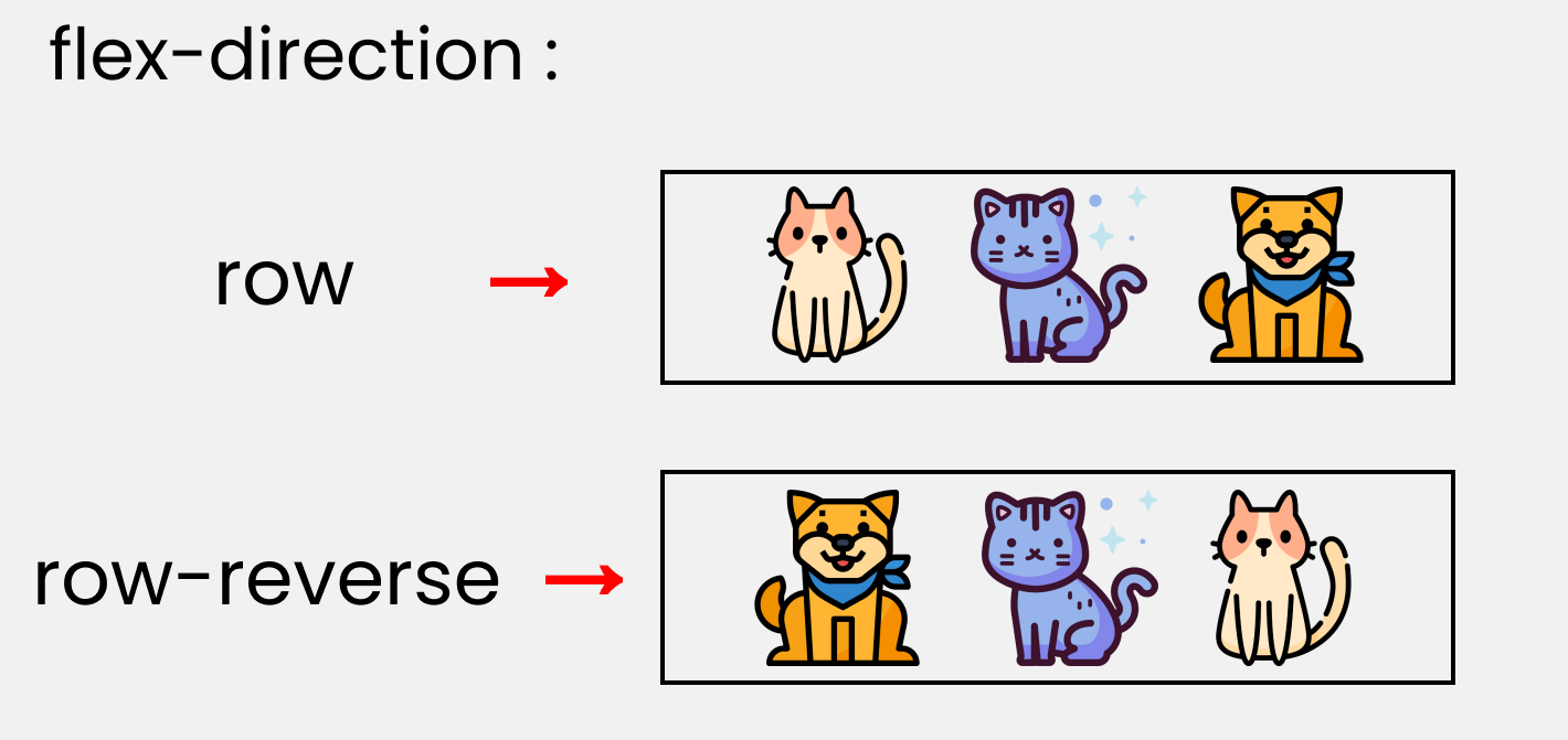

Чтобы у нас получилось то же самое, что и на картинке с котиками, нужно написать такой CSS-код.
Обратите внимание, что мы пишем код внутри класса .container .
Свойство justify-content
Это свойство выстраивает flex-элементы вдоль главной оси внутри flex-контейнера.
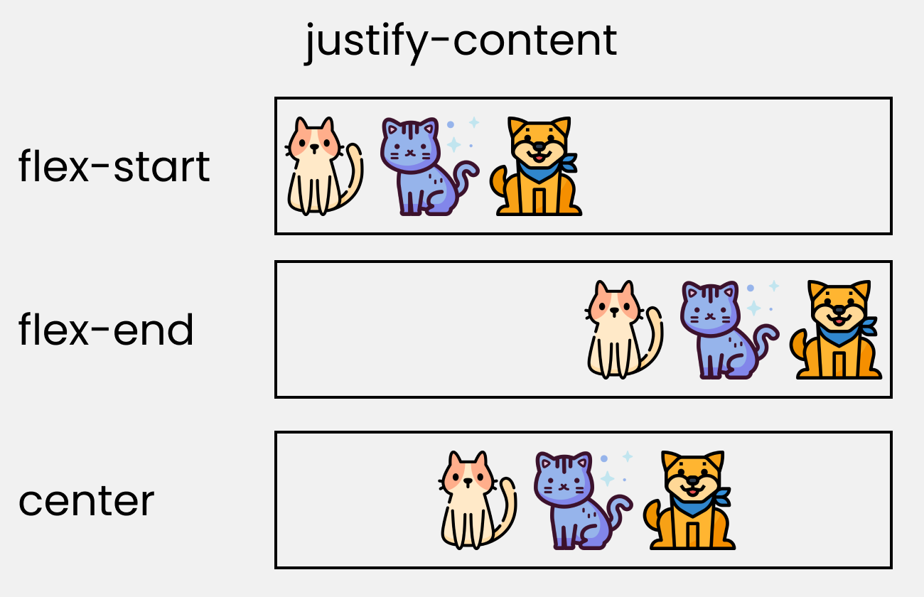

Попробуйте воссоздать это с помощью этого кода CSS:
Свойство align-content
Это свойство выравнивает flex-элементы по поперечной оси внутри flex-контейнера. Оно аналогично свойству justify-content, которое мы рассматривали только что. Разница только в осях выравнивания.


Обратите внимание, что без flex-wrap это свойство не работает. Вот, что должно быть в вашем коде:
Свойство align-items
Это свойство распределяет Flex-элементы вдоль поперечной оси.
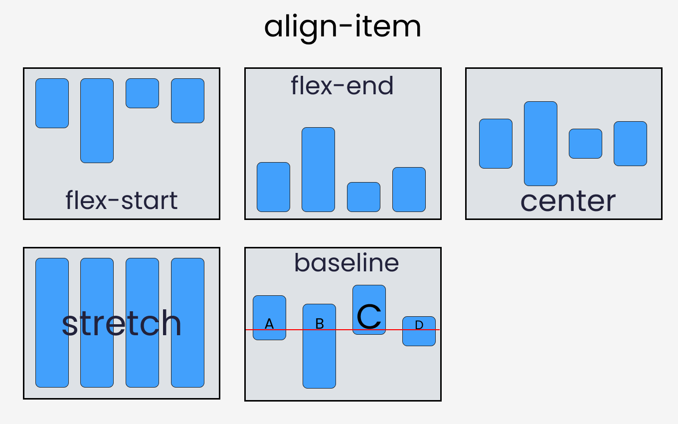
Чтобы протестировать свойство, напишем следующий код в CSS:
Свойство align-self
Это свойство работает с дочерними классами. Оно позиционирует выбранный элемент вдоль поперечной оси.
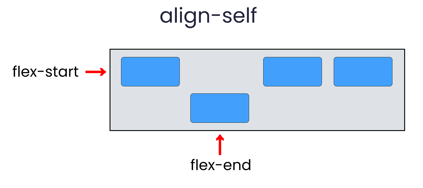
Всего есть 6 значений align-self :
Чтобы воссоздать результат, выберите любой .box-* и напишите следующий код:
Свойства flex-grow, shrink, wrap и basis
Свойства, которые мы сейчас обсудим, будут работать при изменении размера окна. Давайте приступим.
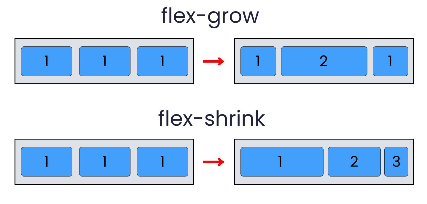
Flex-grow
Это свойство увеличивает размер flex-элемента на основе ширины flex-контейнера.
Flex-shrink
Это свойство уменьшает flex-элемент в зависимости от ширины flex-контейнера. Оно противоположно flex-grow .

Обратите внимание, что flex-grow и flex-shrink работают на дочерних классах. Поэтому мы изменим все наши блоки следующим образом:
Поиграйтесь с размером окна браузера, и вы увидите результат.
Теперь используем flex-shrink .
Обратите внимание, что сначала нужно удалить свойство flex-wrap , иначе flex-shrink не будет работать.
Измените размер окна, и вы увидите результат.
Flex-wrap
Это свойство помогает установить количество flex-элементов в строке или в колонке.

Свойство работает в родительском классе .container . Итак, напишите код:
Flex-basis
Свойство похоже на добавление ширины к flex-элементу, но работает более гибко.
К примеру, flex-basis: 10em установит начальный размер flex-элемента равным 10em . Его конечный размер будет основан на доступном пространстве, на данных flex-grow и flex-shrink .
Как читать сокращения свойств Flexbox
Сокращение flex
Вот, как могут быть одновременно указаны свойства flex-grow , flex-shrink и flex-basis вместе взятые.
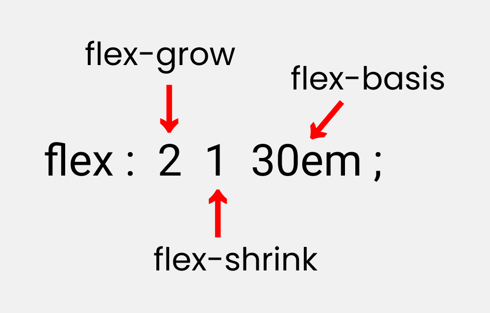
Попробуйте понять сокращение, написав следующий код.
Обратите внимание, что он работает только для дочерних классов.
Сокращение flex-flow
Это сокращение для свойств flex-direction и flex-wrap .

Напишите следующий код, который работает в родительском классе:
Сокращение place-content
Это сокращение для свойств justify-content и align-content .
Обратите внимание, что оно работает в родительском классе.
Если вы дочитали до конца, вам полагается большущая медаль.
Пишите в комментариях, интересны ли вам статьи по CSS и на какие темы. Нам будет приятно знать, что тема востребована.
CSS Flexbox Tutorial with Flexbox Properties Cheat Sheet 🎖️

Joy Shaheb
In this article, I’ll teach you CSS Flexbox basics so you can make your own responsive sites. I’ll explain how each of Flexbox’s properties work, and I’ll give you a cheatsheet that covers everything you can do with Flexbox. Let’s Go 🎖️
Table of Contents
You can watch this tutorial on YouTube as well if you like:

When you’re building a house, you need a blueprint. In the same way, we need a blueprint when we’re making websites. And Flexbox is the blueprint.
The Flexbox model allows us to layout the content of our website. Not only that, it helps us create the structures needed for creating responsive websites for multiple devices.
Here’s a demo which I created using Flexbox as the main blueprint.

Flexbox Architecture
So how does Flexbox architecture work? The flex-items [Contents] are distributed along the main axis and cross axis. And, depending on the flex-direction property, the layout position changes between rows and columns.
Flexbox Chart
This chart contains every possible property and value you can use when you’re working with Flexbox. You can reference it while doing your projects and experiment with different values.
How to Set Up the Project

For this project, you need to know little bit of HTML, CSS, and how to work with VS code. Follow along with me as we complete the following tasks:
- Create a folder named «Project-1» & Open VS Code
- Create index.html and style.css files
- Install Live Server and run it.
Or, you can just open Codepen and start coding.
At the end of this tutorial, you will be able to make accurate and beautiful website layouts.
HTML
In HTML, write these lines of code inside the body tag 👇
CSS
Target the .container class and all the boxes. Then style the boxes so that all of them look similar, like this: 👇
Note: don’t forget to put the height of the container.
But Wait.

Before starting, you need to understand the relationship between parent and child classes.
Flexbox works on the parent class, not on the child classes.
Here, the .container class is the parent and our .box-* classes are our children.
So, apply the display: flex inside the .container class. And place the letters at the center of the box like this:
And. we’re all set! Let’s start coding. 😊

flex-direction property
This property allows us to set the direction and orientation in which our flex-items should be distributed inside the flex-container.

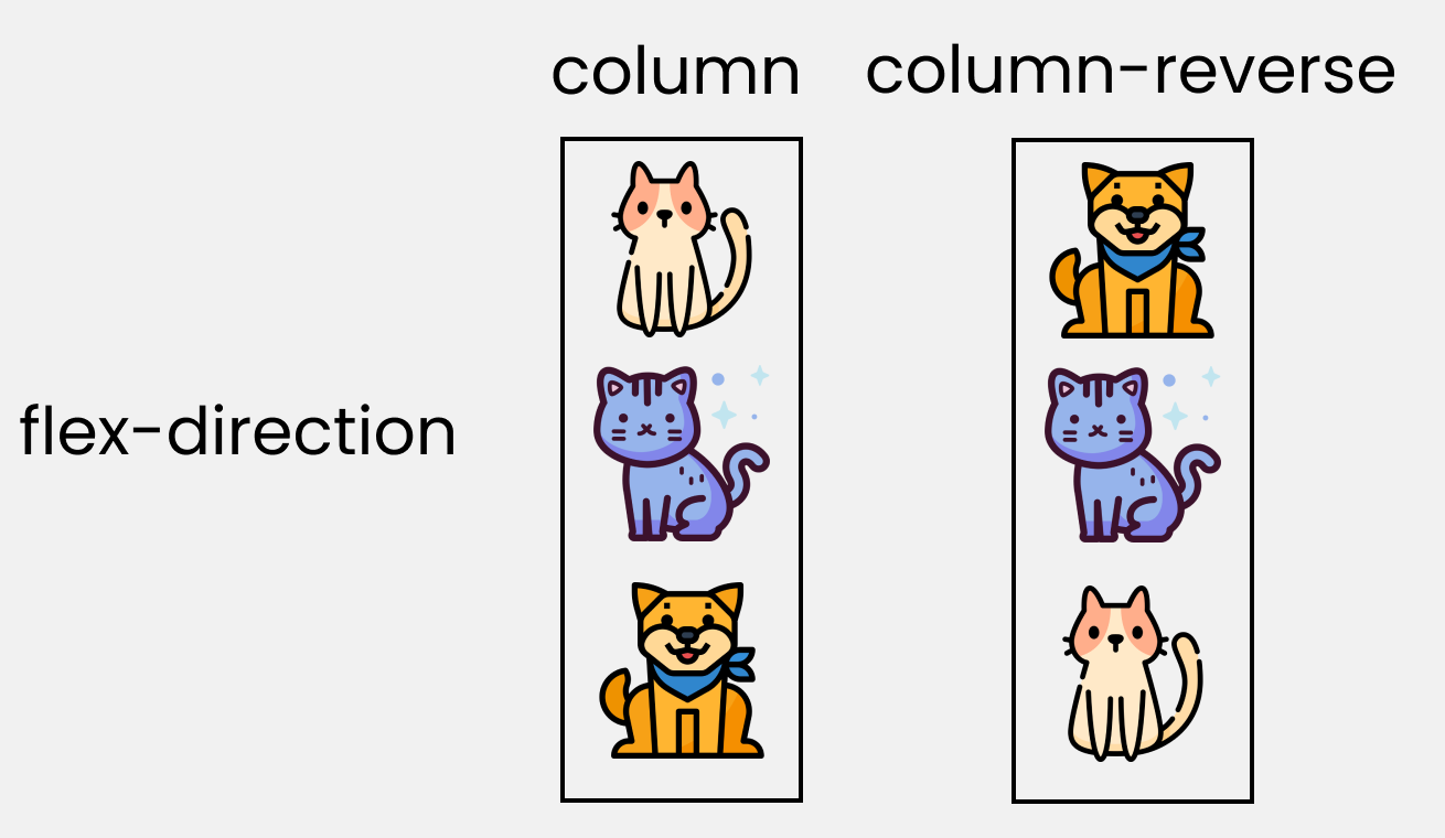
To recreate these results, let’s write these lines in our CSS:
Please note that we’ll write them inside the .container class.
justify-content property
This property arranges flex-items along the MAIN AXIS inside the flex-container.

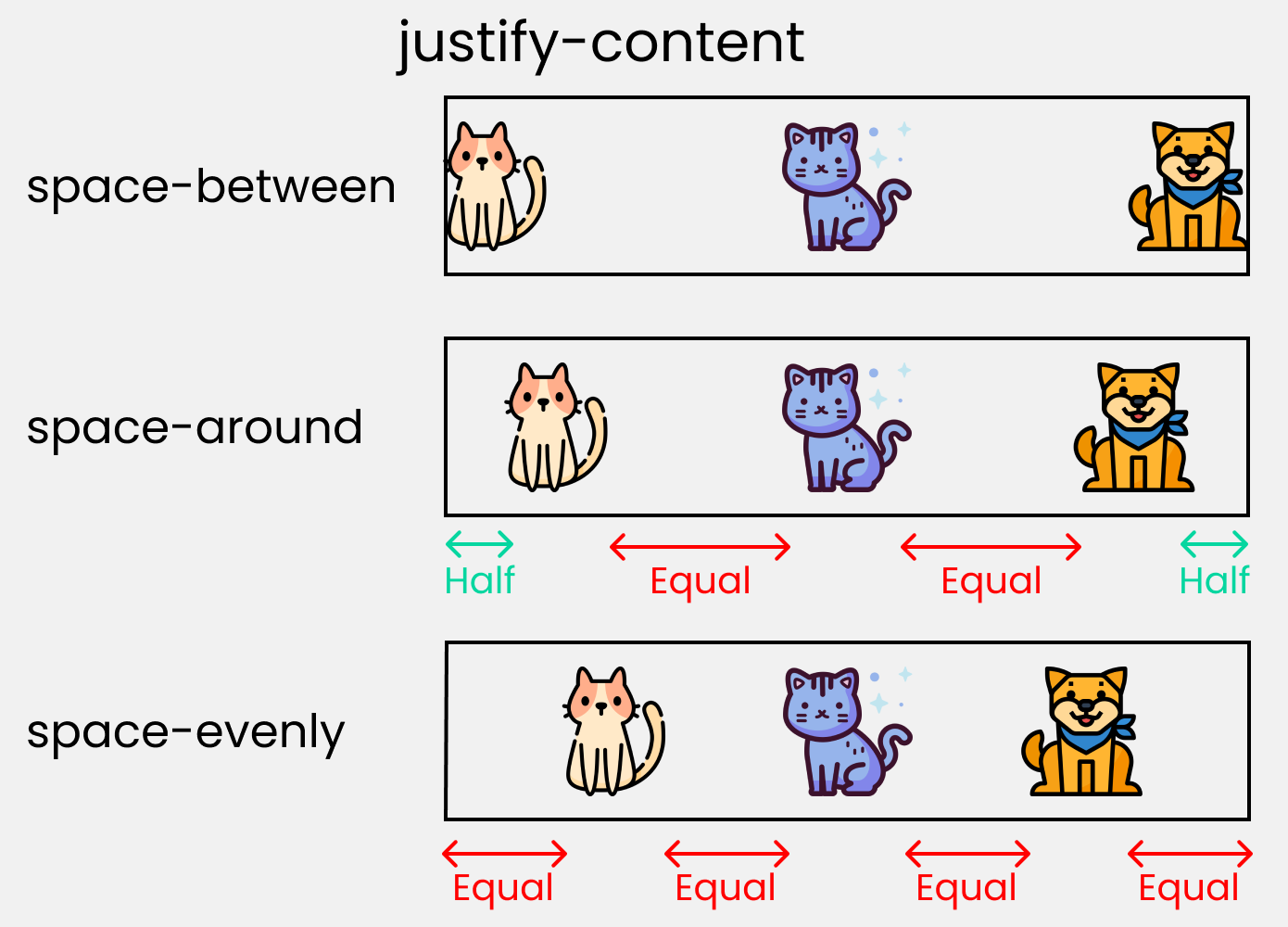
To recreate these results, write these lines in your CSS:
align-content property
This property arranges flex-items along the CROSS AXIS inside the flex-container. This is similar to justify-content.
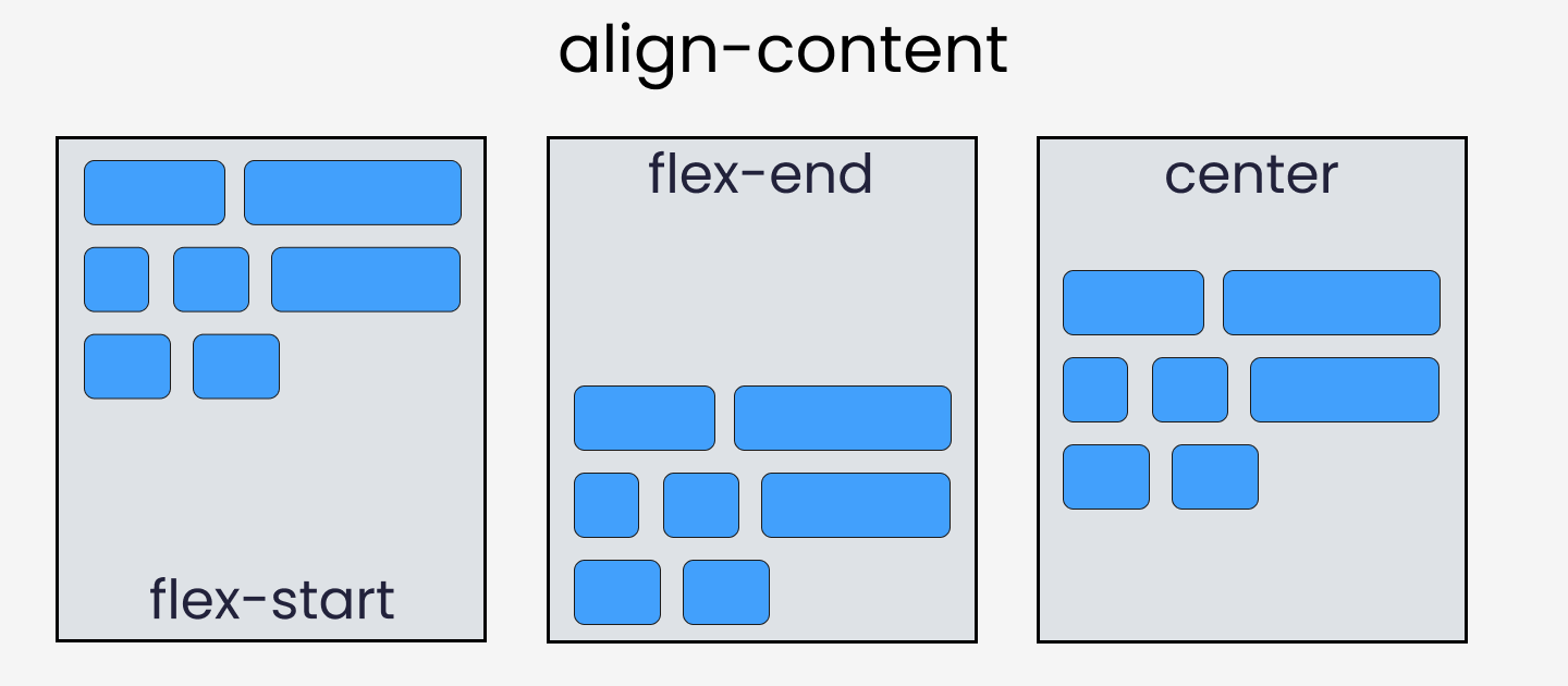
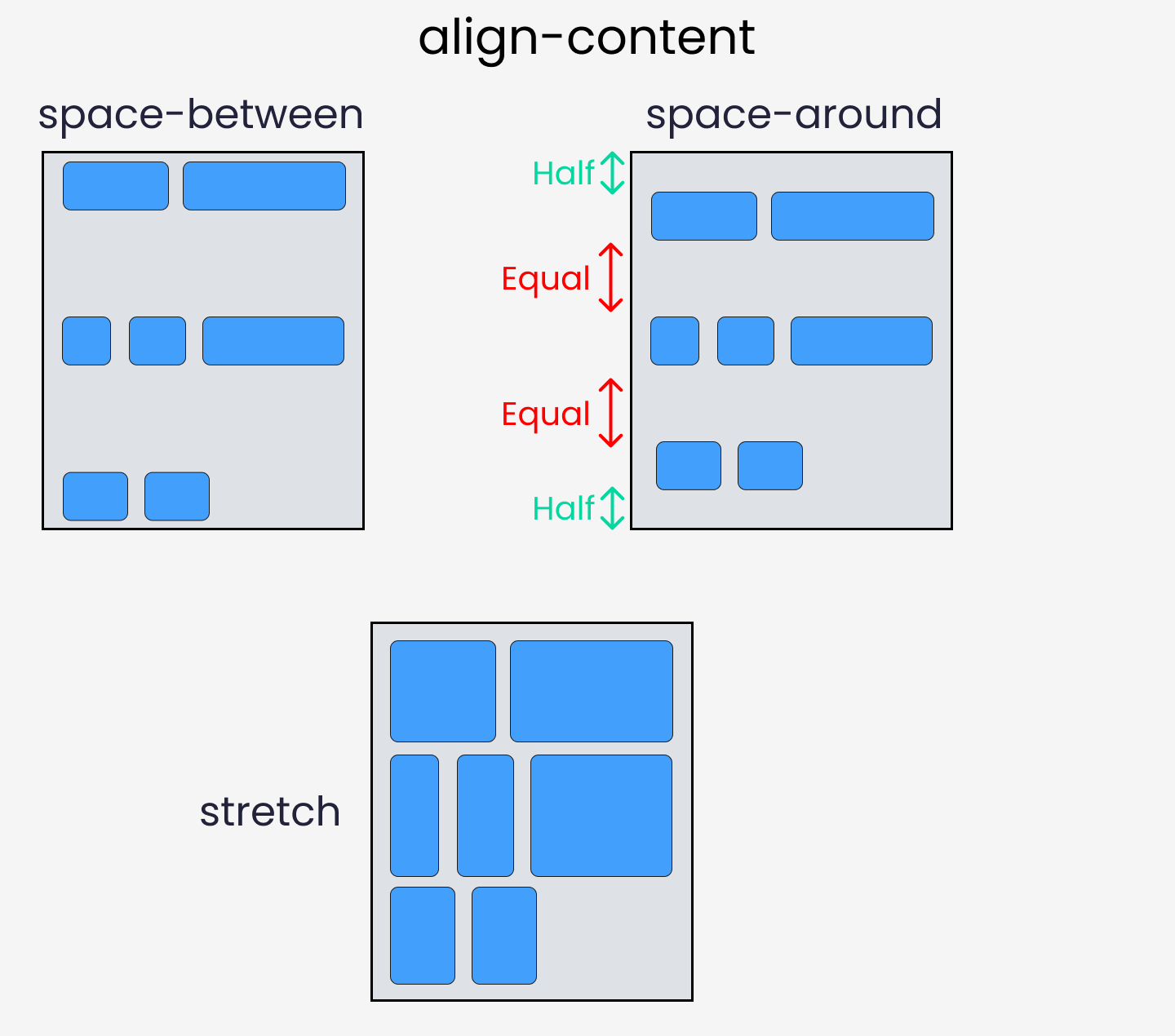
Please note that without the flex-wrap property, this property doesn’t work. Here’s a demo:
align-items property
This property distributes Flex-items along the Cross Axis.

To recreate these results, let’s write the following code in CSS:
align-self property
This property works on the child classes. It positions the selected item along the Cross Axis.

In total we have 6 values:
To recreate the results, select any .box-* and write the following code:
Take a Break
So far so good. Take a break!

flex — grow | shrink | wrap | basis properties
The properties we’ll discuss now will work when we resize the window. Let’s dive right in.
flex-grow
This property grows the size of a flex-item based on the width of the flex-container.
flex-shrink
This property helps a flex item shrink based on the width of the flex-container. It’s the opposite of flex-grow.
To achieve these results, follow me.
Please note that flex-grow and flex-shrink work on child classes. So, we will target all our boxes like this:
Resize the window and you’ll see the results.
To duplicate the result of flex-shrink, write the following code:
Please note that you need to delete the flex-wrap property first, otherwise it won’t work.
Now, resize the window and you’ll see the results.
flex-wrap
This property helps you set the number of flex-items you want in a line or row.
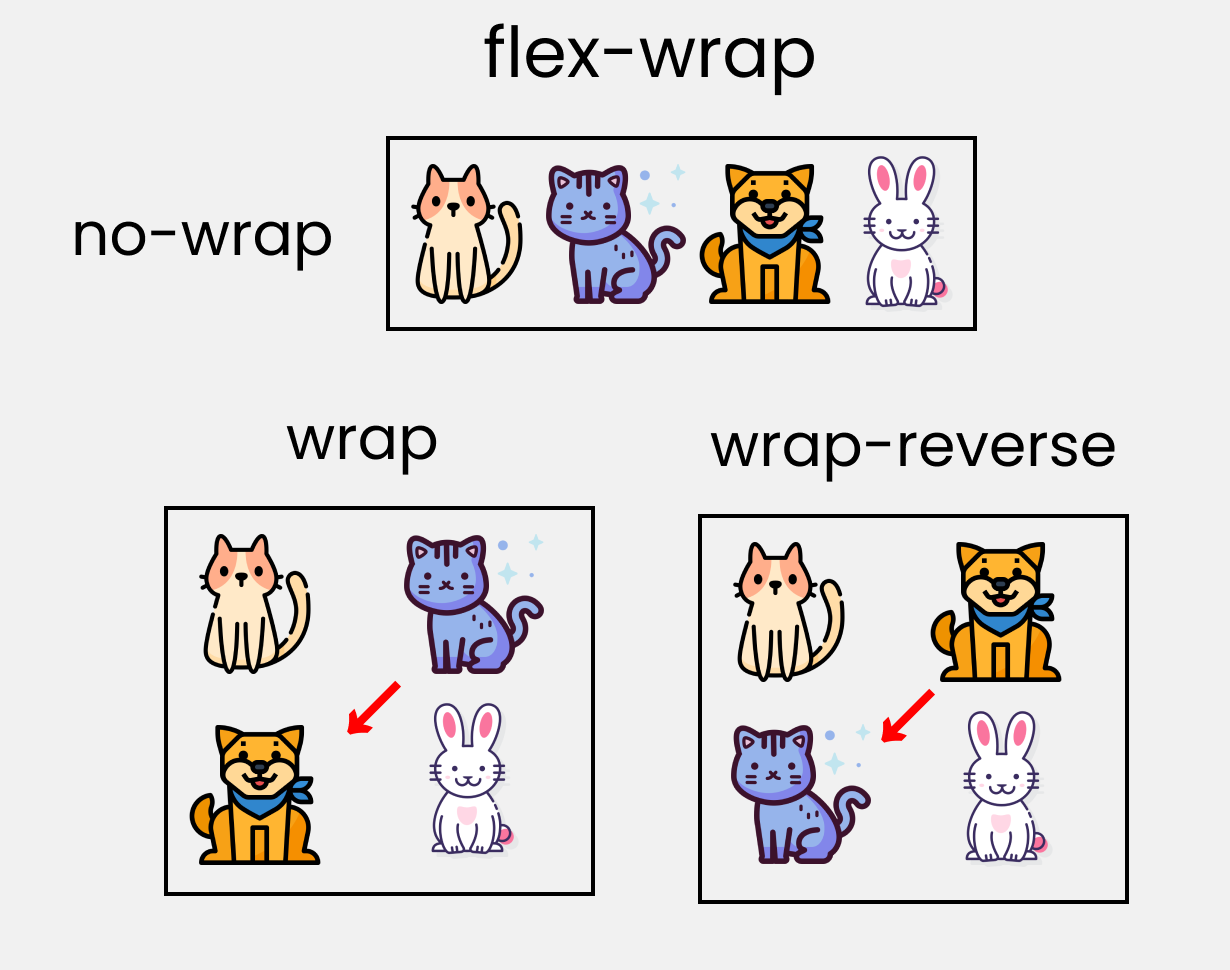
This works on the .container parent class. So, write the following code:
flex-basis
This is similar to adding width to a flex-item, but only more flexible. flex-basis: 10em, for example, will set the initial size of a flex-item to 10em. Its final size will be based on the available space, flex-grow, and flex-shrink.
Shorthand Flexbox Properties
flex shorthand
This is the shorthand for the flex-grow, flex-shrink and flex-basis properties combined.

You can try this by writing the following code:
Please note that it only works on the child classes:
flex-flow
This is the shorthand for the flex-direction and flex-wrap properties:
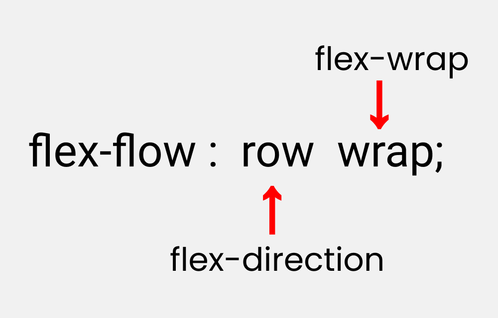
You can try this by writing the following code:
Please note that it only works on the parent class.
place-content
This is the shorthand for the justify-content and align-content properties:
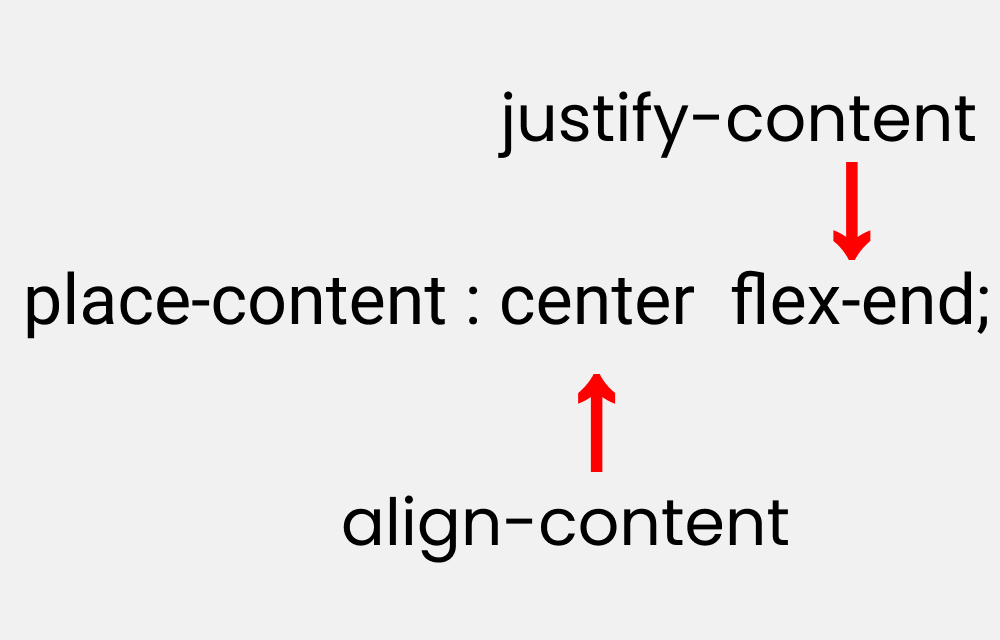
Let’s duplicate the results:
Please note that it works on the parent class.
More Resources
If you want to exercise your Flexbox knowledge, you can read this article of mine where you’ll be building five responsive layouts using Flexbox. Here’s a demo:

Conclusion
Here’s your medal for reading till the end ❤️
Suggestions & Criticisms Are Highly Appreciated ❤️