Infinite Animation in CSS — How it Works + Loop Example
Animations, used to the right extent, can enhance a good experience on your website. Today the best and only universally accepted technology for this is CSS. Follow me and you will learn how to work with loop animations.
To create infinite animations in CSS, we will use the property animation-iteration-count: infinite;.
If you apply this rule to an existing animation, it is done. But for more details, I bring other examples and resources, check out below:
Full example of infinite animation
Below is the complete code for an example of a loading animation. This animation can be applied to images, divs or any other HTML element other than default display: inline element, like texts or links.
.loading < background: #094CFA; width: 60px; height: 60px; margin: auto; border-radius: 4px; /* Here we declare our inline animation */ animation: rotate 3s linear infinite; >/* Here we define our animation with the name "rotate" */ @keyframes rotate < from < transform: rotate(0deg); >to < transform: rotate(359deg); >> The above script will have the same animation effect shown below. I just added some visual effects. If you want to copy, just click on the CSS tab below:
In the CSS loading class, we apply some styles and finally the animation.
To understand what happens, take a look at the animation property and @keyframes rotate.
In animation, we defined the animation in the shorthand method, in only one line, but we could also write it using 4 lines, in the long form:
I always prefer to use the shorthand way of writing, because it doesn’t matter the order in which you define the values of the properties, and it’s much less stuff to memorize.
Using keyframes
Keyframes, as the name implies, are frames that we define with specific times from beginning to end of an animation, to represent it.
If you want to animate an object falling to the ground, for example, you need to define the initial position of the object in the air, and the final position, on the ground. That’s basically what we did with the example animation in this article.
As we can see above, the duration of the animations is not defined within @keyframes, but we use percentages to generally define the time proportion between one keyframe and another. Alternatively, we can use from and to to define the frames 0% and 100% respectively. See the example below to understand it better:
Compatibility of animation among browsers
I worked with Flash for a long time, and a couple of years ago it was the only thing that existed to support animations on the web. Fortunately, for a few years this scenario has changed and CSS animations are the current standard.
According to the site caniuse.com, over 96.5% of users use browsers fully compatible with CSS animations, and as this number tends to increase more and more. In my opinion, there’s nothing to worry about in terms of compatibility.
Using prefixes -moz-animation, -webkit-animation, etc. has also become somewhat archaic. Still according to caniuse, over 94% of users use browsers that no longer require prefixes for animation. I didn’t use prefixes in the examples in order not to prolong the text nor to support something that has been losing importance, but this is up to you. For some other CSS properties, however, it is mandatory to use prefixes.
CSS-анимации
Большой набор свойств для создания настоящих живых анимаций.
- Кратко
- @keyframes
- animation-name
- animation-duration
- animation-iteration-count
- animation-direction
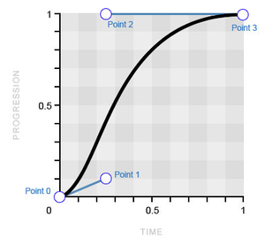
- animation-timing-function
- linear
- ease
- ease-in
- ease-out
- ease-in-out
- cubic-bezier(x1, y1, x2, y2)
- step-start
- step-end
- steps(количество шагов, положение шага)
Обновлено 24 октября 2022
Кратко
Скопировать ссылку «Кратко» Скопировано
Веб в процессе развития из текста с картинками превратился в интерактивное пространство. Заходя на разные сайты, вы постоянно видите анимации. От микроскопических реакций на наведение курсора до сложных сцен.

Вернёмся к нашему розовому кругу и укажем, что он должен превращаться в синий квадрат нелинейно, медленно разгоняясь к концу анимации.
.child-one animation-name: circle-to-square; animation-duration: 5s; animation-iteration-count: infinite; animation-direction: alternate; animation-timing-function: ease-in;>.child-one animation-name: circle-to-square; animation-duration: 5s; animation-iteration-count: infinite; animation-direction: alternate; animation-timing-function: ease-in; >Анимация стала более естественной, не такой компьютерной.
Пришло время заняться правой фигурой и превратить синий квадрат в розовый круг. Используем практически те же самые свойства, что и для круга, только зададим другое значение для свойства animation — direction , чтобы шаги анимации воспроизводились в обратном порядке:
.child-two animation-name: circle-to-square; animation-duration: 5s; animation-iteration-count: infinite; animation-direction: alternate-reverse; animation-timing-function: ease-in;>.child-two animation-name: circle-to-square; animation-duration: 5s; animation-iteration-count: infinite; animation-direction: alternate-reverse; animation-timing-function: ease-in; >Сейчас обе фигуры меняются синхронно. Добавим правой фигуре небольшую задержку.
animation — delay
Скопировать ссылку «animation-delay» Скопировано
Свойство задаёт задержку воспроизведения анимации. Значением может быть любое число, как отрицательное, так и положительное.
Если значение положительное, то будет задержка перед началом анимации. Если значение отрицательное, то анимация начнётся как бы за кадром.
Пусть анимация правого элемента начнётся с задержкой -2.5 секунды. Так она будет начинаться с середины:
.child-two animation-name: circle-to-square; animation-duration: 5s; animation-iteration-count: infinite; animation-direction: alternate-reverse; animation-timing-function: ease-in; animation-delay: -2.5s;>.child-two animation-name: circle-to-square; animation-duration: 5s; animation-iteration-count: infinite; animation-direction: alternate-reverse; animation-timing-function: ease-in; animation-delay: -2.5s; >animation — play — state
Скопировать ссылку «animation-play-state» Скопировано
Свойство, позволяющее ставить анимацию на паузу и запускать снова.
- running — анимация проигрывается (значение по умолчанию).
- paused — анимация ставится на паузу. При повторном запуске анимации она продолжается с того места, где была остановлена.
Добавим возможность взаимодействовать с нашей анимацией. Пусть по наведению курсора анимация ставится на паузу, а если курсор убран, то продолжает проигрываться.
.child:hover animation-play-state: paused;>.child:hover animation-play-state: paused; >animation — fill — mode
Скопировать ссылку «animation-fill-mode» Скопировано
Последнее свойство анимации — animation — fill — mode — сообщает браузеру, нужно ли применять стили ключевых кадров до или после проигрывания анимации.
- none — стили анимации не применяются до и после проигрывания анимации (значение по умолчанию).
- forwards — после окончания анимации элемент сохранит стили последнего ключевого кадра.
- backwards — после окончания анимации к элементу будут применены стили первого ключевого кадра.
- both — до начала анимации к элементу применяется первый ключевой кадр, а после окончания анимации элемент останется в состоянии последнего ключевого кадра.
Для лучшего понимания работы этих значений посмотрите демо 👇
animation
Скопировать ссылку «animation» Скопировано
animation — это мега-шорткат, в котором можно за раз указать значения для всех перечисленных выше свойств, начинающихся на animation — .
Значения указываются через пробел. Порядок указания значений не важен. Из-за того, что значения этих свойств очень разные, браузер сам догадывается, какое значение к какому свойству относится. Важно только помнить, что первое значение времени будет воспринято как значение animation — duration (длительность анимации), а второе — animation — delay (задержка воспроизведения).
Для работы анимации совсем не обязательно перечислять все значения. Достаточно указать имя анимации и её длительность. Для остальных свойств будут установлены значения по умолчанию.
.child-two animation: circle-to-square 2s infinite alternate-reverse ease-in 1s;>.child-two animation: circle-to-square 2s infinite alternate-reverse ease-in 1s; >Несколько анимаций
Скопировать ссылку «Несколько анимаций» Скопировано
Есть возможность применить к одному элементу сразу несколько анимаций. Для этого нужно перечислить несколько значений через запятую. Возможно указать любое количество значений для любого из свойств анимации. Анимации будут воспроизводиться одновременно.
Например, разобьём предыдущую анимацию на две отдельные. Одна будет отвечать за изменение формы элемента, а вторая за изменение цвета.
@keyframes circle-to-square from width: 50px; height: 50px; > 50% width: 100%; height: 50px; > to width: 100%; height: 100%; >> @keyframes color-change from background-color: #F498AD; > 50% background-color: #7F6EDB; > to background-color: #2E9AFF; >>@keyframes circle-to-square from width: 50px; height: 50px; > 50% width: 100%; height: 50px; > to width: 100%; height: 100%; > > @keyframes color-change from background-color: #F498AD; > 50% background-color: #7F6EDB; > to background-color: #2E9AFF; > >И присвоим обе анимации одному элементу, при этом задав первой задержку, и указав разное время воспроизведения.
.child animation: circle-to-square 10s infinite alternate ease-out 1s, color-change 5s alternate linear infinite;>.child animation: circle-to-square 10s infinite alternate ease-out 1s, color-change 5s alternate linear infinite; >В итоге форма меняется за 10 секунд, а цвет перетекает из розового в синий за 5 секунд. А потом обратно. Очень красиво и медитативно 🙌