- Block Templates
- Breadcrumbs
- Carousel
- Cart content
- Central
- Copyright information
- Currencies
- Dropdown horizontal
- Dropdown vertical
- Feature comparison
- Gift certificate
- Gift certificate verification
- Grid
- Grid 2
- HTML block
- HTML block with Smarty support
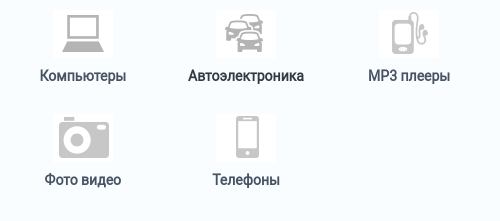
- Icon
- Languages
- Links thumb
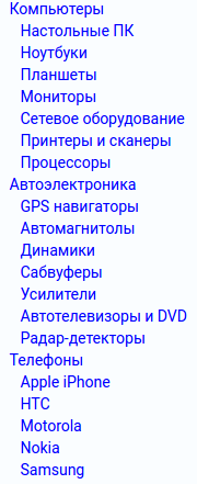
- Multi-column list
- Multicolumns small
- My account
- My account links
- Newsletter subscription form
- Order information
- Original
- Our Brands
- Payment systems icons
- Payments
- Products
- Products in cart
- Products2
- Products grid
- Profile information
- Quick links
- Scroller
- Search field
- Shipping estimation
- Shippings
- Short list
- Side box
- Side box first item
- Site News
- Small items
- Store locator
- Store logo
- Summary
- Tag cloud
- Testimonials
- Text links
- The 404 Not Found Error Message
- Vendors
- Without image
- Содержание
- Сейчас
- Блоки
- В этом разделе
- Содержание
- Block Types and Properties
- Common properties
- Type-dependent properties
- Banners
- Brands
- Breadcrumbs
- Block Types and Properties
- Common properties
- Type-dependent properties
- Banners
- Brands
- Breadcrumbs
Block Templates
A simple list of text links with the dates of publishing.
Breadcrumbs
Standard breadcrumbs navigation aid.
Carousel
Items appear in a carousel-like manner: a horizontally scrollable list with pagination where only one item at a time is displayed.
This template has the following settings:
- Navigation — Type of the item switcher in the list: dots, digits, or arrows. You can also disable manual switching between the items by selecting None. In this case, items will be switching automatically.
- Delay (in seconds) — Number of second to pass before items switch over.
Cart content
Standard mini-cart to be placed on the storefront pages.
Central
Layout intended for the content appearing in the center of the page.
Copyright information
Copyright information that you have specified in Settings → Company.
Currencies
A list of supported currencies defined in Administration → Currencies. Appearance options should be configured in the block settings.
Dropdown horizontal
List of categories with drop-down lists that are displayed top-to-bottom. For hierarchical list, the following menu options are supported:
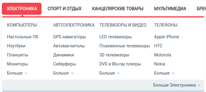
- Second level elements — Maximum number of second-level elements within a menu item.
- Third level elements — Maximum number of third-level elements within a second-level menu item.
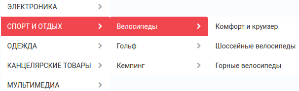
Dropdown vertical
List of categories with drop-down lists that are displayed vertically left-to-right. To display lists right-to-left choose Right to left orientation checkbox.
Feature comparison
List of products selected for comparison.
Gift certificate
Form to apply a gift certificate to the order.
Gift certificate verification
Field to enter the number of a gift certificate.
Grid
Items (item thumbnail next to a text link) arranged in a grid.
Grid 2
Items (item thumbnail above a text link) arranged in a grid.
HTML block
HTML block with Smarty support
Custom HTML/Smarty content.
Icon
Regular RSS feed icon to the store RSS feed.
Languages
List of storefront languages defined in Administration → Languages.
Links thumb
Product thumbnail with a text link to the product page.
Multi-column list
List of items arranged in multiple columns. Number of columns is defined through the template option Number of columns in the objects list.
Multicolumns small
List of small items arranged in multiple columns.
My account
Links to the account details of the logged in customer.
My account links
Links to the account pages of the customer who has logged in.
Newsletter subscription form
Form to subscribe to newsletters.
Order information
Order details on the checkout page.
Original
Box with all available product filters and a price slider.
Our Brands
A list of product brands that are defined as features with the Brand/Manufacturer type.
Payment systems icons
Icons of the supported payment systems in the store.
Payments
Icons of all the available payment methods in the store.
Products
Products are displayed in the box just the same as they are displayed in a typical product list.
Products in cart
Cart contents displayed during the checkout process.
Products2
Products are displayed with thumbnails and price, and are arranged in multiple columns.
Products grid
Products are displayed with big thumbnails and price, and are ordered by grid.
Profile information
Profile details of a customer who has logged in. These include login credentials and personal data.
Quick links
Active quick links defined in Design → Menus.
Scroller
Scrolled list of products.
Search field
Shipping estimation
Box with estimated shipping rates.
Shippings
Icons of all the available shipping methods in the store.
Short list
Products are displayed with small thumbnails, and are arranged in a table.
Side box
Template for a poll or questionnaire that is placed inside a side box.
Side box first item
The first product is displayed with a thumbnail and a text link, and the rest of the products are represented as a link to the products page.
Site News
A list of links to recently added news according to the date.
Small items
Product thumbnail with a text link to the product page.
Store locator
Location of your store on Google’s map as specified in Add-ons → Store locator.
Store logo
Storefront logo as specified in the Visual Editor in Design → Themes.
Summary
Template to display the order summary on the checkout page.
Tag cloud
List of tags that the store administrator created in Website → Tags.
Testimonials
List of testimonials submitted by the customers. To manage testimonials, use the Website → Testimonials section.
Text links
A simple list of text links.
The 404 Not Found Error Message
Textual notification for users that the requested page cannot be found.
Vendors
List of active vendors accounts in the store.
This template is available only for Multi-Vendor.
Without image
Simple text link together with the product price.
Содержание
Сейчас
- Block Templates
- Authentication information
- Blog: recent posts
- Blog: recent posts scroller
- Blog: text links
- Breadcrumbs
- Carousel
- Cart content
- Central
- Copyright information
- Currencies
- Dropdown horizontal
- Dropdown vertical
- Feature comparison
- Gift certificate
- Gift certificate verification
- Grid
- Grid 2
- HTML block
- HTML block with Smarty support
- Icon
- Languages
- Links thumb
- Multi-column list
- Multicolumns small
- My account
- My account links
- Newsletter subscription form
- Order information
- Original
- Our Brands
- Payment systems icons
- Payments
- Products
- Products in cart
- Products2
- Products grid
- Profile information
- Quick links
- Scroller
- Search field
- Shipping estimation
- Shippings
- Short list
- Side box
- Side box first item
- Site News
- Small items
- Store locator
- Store logo
- Summary
- Tag cloud
- Testimonials
- Text links
- The 404 Not Found Error Message
- Vendors
- Without image
Блоки
Если контейнеры формируют структуру витрины, то блоки наполняют эту структуру содержимым и рабочими элементами. Блоки — это отдельные компоненты витрины: поисковые формы, переключатели языков и валют, меню, фильтры товаров, баннеры, списки товаров, текст, HTML-вставки и другое содержимое. По сути, все элементы витрины отображаются с помощью блоков.
Основное отличие блоков друг от друга — это тип данных, заложенных в них. Однако даже блоки с одинаковым типом данных могут иметь различные наполнение, вид и настройки. Можно сделать так, чтобы какие-то блоки появлялись только на отдельных страницах.
Изначально CS-Cart уже включает в себя несколько настроенных блоков. Их можно использовать для того, чтобы быстро добавить на витрину самые популярные и необходимые элементы. Также существует возможность создания собственных блоков на основе доступных шаблонов.
В этом разделе
Содержание
- Установка и переезд
- Администрирование
- О панели администратора
- Внешний вид
- Отдельные правки
- Документы
- Шаблоны email-уведомлений
- Языки
- Макеты
- Блоки
- Работа с блоками
- Как создать блок “Товары со скидкой”
- Как показать категории на домашней странице витрины
- Как добавить блок “Хиты продаж” на домашнюю страницу
- Как показывать разные баннеры на разных страницах категорий
- Как скрыть блок строки навигации на страницах авторизации и профиля
- Как вывести блок с новыми поступлениями на страницы магазина
- Как добавить раздел “Похожие товары” на детальную страницу товара
- Разработка
- Дизайн
- Обновление CS-Cart
- Часто задаваемые вопросы
- История изменений
Block Types and Properties
When you create a block, you need to choose a block type and also specify the block properties. The block type defines the type of information that the block contains. Block properties enable you to fine-tune the block to meet your specific requirements. The set of available properties may vary depending on the block type. After a block has been created, you can edit its properties at any time.
Common properties
Blocks have the following common properties regardless of their type:
- Name — Name/title of the block as it appears in Layouts.
- Wrapper — Template to border the block.
- User-defined CSS-class — Name of a custom CSS-class that you want to use for the block. The CSS-class itself is to be defined in the file styles.css located in the theme directory of your CS-Cart installation.
Type-dependent properties
This is the list of available block types and the applicable type-specific properties:
Banners
Brands
Breadcrumbs
Description Breadcrumbs, a navigation aid for visitors to keep track of their location on the storefront. Breadcrumbs provide links to the parent pages of the current one. Related add-ons None Templates Breadcrumbs Content Automatic Block settings None Block Types and Properties
When you create a block, you need to choose a block type and also specify the block properties. The block type defines the type of information that the block contains. Block properties enable you to fine-tune the block to meet your specific requirements. The set of available properties may vary depending on the block type. After a block has been created, you can edit its properties at any time.
Common properties
Blocks have the following common properties regardless of their type:
- Name — Name/title of the block as it appears in Layouts.
- Wrapper — Template to border the block.
- User-defined CSS-class — Name of a custom CSS-class that you want to use for the block. The CSS-class itself is to be defined in the file styles.css located in the theme directory of your CS-Cart installation.
Type-dependent properties
This is the list of available block types and the applicable type-specific properties:
Banners
Brands
Breadcrumbs
Description Breadcrumbs, a navigation aid for visitors to keep track of their location on the storefront. Breadcrumbs provide links to the parent pages of the current one. Related add-ons None Templates Breadcrumbs Content Automatic Block settings None
- Блоки