- Animating Gradients with Pure CSS
- Part 1: Understanding the Technique
- Rules of Aspects
- Basic Idea
- Bonus Example
- Part 2: Animating Gradients
- Adding Gradient Colors
- Setting the Width of the Belt
- Animating the Belt
- Tools
- CSS Gradient Animator
- Pure CSS Animated Gradient Generator
- Анимируем CSS-градиенты
- Сайдбар
- Статьи
- Страницы
- Проекты
- Сборник анимированных градиентов
- Плавная смена цветов по горизонтали
- Результат:
- Плавная смена цветов по вертикали
- Результат:
- Плавная смена цветов по диагонали
- Результат:
- Бегущие полоски
- Результат:
- Бегущие полоски 2
- Результат:
- Комментарии
- Другие публикации
- Анимированный градиент на чистом CSS
- Анимированный градиент — код и пояснения
- Результат
Animating Gradients with Pure CSS
In this article, I will demonstrate how to animate gradients in an infinite, linear fashion using nothing but HTML and CSS. This is not the only animation technique for gradients, but I’ve found it’s one of the more elegant and versatile.
Part 1: Understanding the Technique
- Stage — A parent container that designates where the visible area of the animation begins and ends. Think of this like a theatre stage, where the left and right sides are blocked by curtains. Anything that goes from the visible area of the stage to behind the curtains will be invisible to the audience. For now, everything is visible for demonstration purposes.
- Belt — A child container nested within the stage to house visually-distinguishable elements. Think of this like a portion of a conveyor belt at the grocery store. Items on top of it are stationary but the belt moves items through space. This is what actually performs the animation.
- Aspects — A sequence of visually-distinguishable elements within the belt. This example uses dots. Later, we’ll use gradients. Whatever elements you choose, there are several rules:
Rules of Aspects
- There must be at least two aspects in the sequence.
- The first and last aspect(s) must be identical.
- All aspects must be evenly spaced along the belt.
- Note: even spacing is achieved here with Flexbox’s justify-content: space-around .
In this example, the intention is to animate the aspects from the left to the right of the stage, so we start with the position of the belt offset to the left of the stage. The width and the offset distance of the belt are significant. They determine how many aspects will appear within the visible area at any given moment of the animation.
This animation has two aspects where one aspect will be visible at any given time. That means the last aspect of the sequence (Aspect #2) must visually appear in the exact same position on the screen in which the first aspect of the sequence (Aspect #1) will appear at the end of a single iteration of the animation.
Basic Idea
Start with the right side of the belt at the right-most edge of the stage. Animate the belt until its left side reaches the left-most edge of the stage.
When the belt completes a single iteration of its animation, it instantly teleports back to its original location, where the last aspect of the sequence (Aspect #2) visually replaces the first aspect of the sequence (Aspect #1) and continues its journey on the next iteration of the animation.
This is what that looks like:
Then, just apply an overflow: hidden to the stage and its sides begin to behave correctly as theatre curtains to complete the illusion of perpetual motion within the visible area:
As you can see, one of two aspects is fully visible at any given time.
Bonus Example
Here’s what that same setup looks like with three aspects:
After the overflow: hidden is applied, two of the three aspects are fully visible at any given time.
Note that the second and third aspects at the beginning of the animation appear identical to the first and second aspects at the end of the animation.
Part 2: Animating Gradients
Let’s begin by establishing the first fundamental HTML element: the stage. We’re using an article tag here, but any HTML element can be substituted.
Give it some arbitrary dimensions in CSS to designate the visible area:
.stage height: 200px; width: 200px; > Add some optional presentational styles:
body background-color: #8fb6ff; margin: 0; padding: 3rem; > .stage background-color: #fff; box-shadow: 0 3px 14px #000; border-radius: 1rem; height: 200px; width: 200px; > Since we’re using gradients as the aspects, we can take advantage of CSS3 and utilize background-image: linear-gradient() to make the stage’s background act as both the belt and aspects and avoid superfluous HTML. The stage’s background-image will establish the belt and the linear-gradient() will define aspects.
Adding Gradient Colors
For the stage’s gradient, we’ll use the colors Cerise and Mustard.
background-image: linear-gradient(90deg, #da3287, #ffde5e); A convenient thing about linear-gradient is that browser technology has advanced so much that browser vendor prefixes for this CSS function are no longer necessary for this to work in all contemporary browsers.
In this animation technique, a gradient is an aspect. It’s easier to abstract gradients as aspects when you think of each pair of colors in a gradient as a single element.
At the moment there’s only one aspect, a gradient of Cerise to Mustard, which violates the rules of aspects because there needs to be at least two aspects in a sequence.
Let’s duplicate this color pair to create two more aspects.
background-image: linear-gradient(90deg, #da3287, #ffde5e, #da3287, #ffde5e); - A gradient of Cerise to Mustard #da3287, #ffde5e
- A gradient of Mustard to Cerise #ffde5e, #da3287
- A gradient of Cerise to Mustard #da3287, #ffde5e
Setting the Width of the Belt
Right now all the aspects are visible on the stage. A change needs to be made to ensure that only one aspect will be visible at a time during the animation.
This particular animation will animate on the X-axis which means the width of the stage’s belt needs to be modified. This is achieved by multiplying the X-axis of the background-size (100%) by the number of aspects (3).
The Y-axis is set to 100% because we want the gradient to cover the entirety of the stage’s height.
Although it looks as it did before, the background of the stage (the belt) has actually been extended three times beyond the bounds of its parent container in the horizontal direction. This isn’t visible because the stage is doing its job and limiting the visible area.
With the belt and aspects all ready to go, all that remains is animating.
Animating the Belt
The background-position of the stage’s background-image (its belt) is set by the browser to 0 0 by default. This means the gradient is positioned at the top left of the stage.
We want the position of the background to animate from its left-most edge (where it is currently) to its right-most edge.
These @keyframes describe that animation behavior:
@keyframes animateBg 0% background-position: 0 0; > 100% background-position: 100% 0; > > Lastly, give this behavior to the stage.
.stage animation: animateBg 2s infinite linear; . And voila, a linearly-animated gradient that moves infinitely to the left.
Tools
CSS Gradient Animator
This is the classic tool from Ian Forrest that uses a slightly different technique to achieve an eased, oscillating animated effect.
Pure CSS Animated Gradient Generator
I recently wrote a tool in React to generate the same CSS we just used to create infinitely linear animated gradients. It allows you to customize colors, duration, and the direction.
I’ve also open sourced this tool on GitHub and GitLab for anyone who wants to contribute features or improvements:
Playing around with these tools should give you a deeper understanding of the mechanics behind animating gradients.
Critique and suggestions are welcome.
Анимируем CSS-градиенты
Если быть точным, положение и размер градиента анимируются успешно (как и любого другого фона):
Но попытка манипулировать цветами, составляющим градиент, терпит крах:
В FF цвета в примере не будут меняться вообще, в Хроме — будут, но резко, без плавного перехода.
UPD: В Webkit с помощью Sass можно сделать имитацию плавной смены цветов, но код получается неприличных размеров. Пример: codepen.io/yoksel/pen/gBDFj. На момент правки демо не работает в Firefox (27.0.1), анимация просто игнорируется.
В некоторых случаях при необходимости сделать градиент с плавной сменой цветов можно использовать box-shadow , который прекрасно анимируется. Тест:
DIV background: gold; box-shadow: 0 -200px 100px -120px crimson inset; animation: background 3s infinite alternate; > @keyframes background 50% background: skyblue; box-shadow: 0 -200px 100px -100px yellowgreen inset; > >Фоновый цвет в данном случае является частью градиента.
Тень задается с параметром inset (внутреняя тень), с большим радиусом размытия (в примере 100px ), чтобы сымитировать градиент, и с большими отрицательными отступами ( -120px ) — чтобы от обычной внутренней тени была видна только нижняя часть. Почитать подробнее про тени можно тут.
Сложные градиенты делаются несколькими тенями:
Код конечно получается большим и неудобным, но он вполне решает задачу.
Способ придумался когда мне захотелось сделать анимацию, в которой можно было менять цвет неба в зависимости от времени суток:
Тени отлично справились. Я думаю, что способ может быть полезен в некоторых случах и вполне имеет право на сущестование.
Сайдбар
Статьи
- Математические функции в CSS
- Адаптивное видео с помощью встроенных математических функций CSS
- Недоступность в картинках
- Единицы размеров в CSS
- Генератор цветовых тем
- Jekyll → Gatsby
- Вариативные шрифты
- Размеры в SVG
- Адаптивный Pixel Perfect
- Логотип не отвечает или временно недоступен
- SVG-паттерны
- Мыльные пузыри на SVG
- SVG-градиенты
- Весёлая консолька
- SVG-маски
- Умная прокрутка со Scroll Snap Points
- CSS-анимации для ротации изображений
- Анимированные SVG-маски
- Странности обводки в SVG
- SVG-прелоадеры
- Анимируем градиенты ещё раз
- Background-blend-mode
- Возможности оформления SVG
- CSS и SVG маски
- Nth-child и nth-of-type
- SVG-иконки
- SVG: заливка и обводка
- SVG-path
- SVG: группировка и переиспользование элементов
- SVG-фигуры и трансформации
- SVG
- СSS-градиенты и 3D
- Рисовалка анимированных теней
- Свежие CSS-паттерны
- CSS-паттерны
- Радиальные градиенты
- Линейные градиенты
- Крестики-нолики на CSS
- Border-image
- Электронные часы на CSS и JS.
- Сколько весят селекторы?
- Символы юникода
- Свойство content
- Анимируем CSS-градиенты
- Текстовые эффекты
- Древовидный список на CSS
- Css-селекторы, часть 2
- Css-селекторы
- Контекст наложения
- Два способа «прошить» элемент по краю
- Box-sizing
- Цвета в CSS
- Фон под строчками: добавляем поля
- Box-shadow
- Css-фигуры: лепесток
- Transform
- Css Animation
- 3D-куб
- Border-radius
- First letter
- Эти глаза напротив
- CSS-фигуры
- Стрелки с помощью свойства border
- Flexbox
Страницы
Проекты
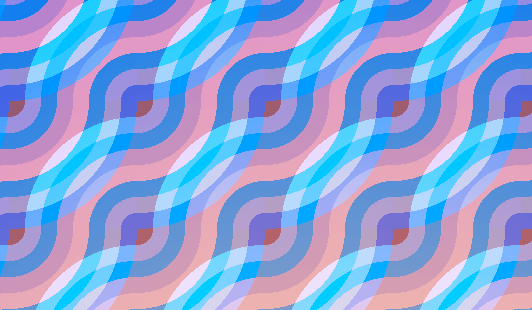
Сборник анимированных градиентов
Сборник анимированных градиентов c использованием CSS keyframes.
Плавная смена цветов по горизонтали
body < background: linear-gradient(90deg, #ee7752, #e73c7e, #23a6d5, #23d5ab); background-size: 400% 400%; animation: gradient 10s ease infinite; transform: translate3d(0, 0, 0); >@keyframes gradient < 0% < background-position: 0% 50%; >50% < background-position: 100% 50%; >100% < background-position: 0% 50%; >>Результат:
Плавная смена цветов по вертикали
body < background: linear-gradient(180deg, #641e39, #98749b, #ddf810, #8f4ff4); background-size: 400% 400%; animation: gradient 10s ease infinite; >@keyframes gradient < 0% < background-position: 50% 0%; >50% < background-position: 50% 100%; >100% < background-position: 50% 0%; >>Результат:
Плавная смена цветов по диагонали
body < background: linear-gradient(-45deg, #ed193b, #a98055, #f286e2, #681d7a); background-size: 400% 400%; animation: gradient 10s ease infinite; >@keyframes gradient < 0% < background-position: 0% 50%; >50% < background-position: 100% 50%; >100% < background-position: 0% 50%; >>Результат:
Бегущие полоски
Результат:
Бегущие полоски 2
Результат:
Комментарии
Другие публикации

Такой эффект можно сделать с помощью :before у родительского элемента. Поверх изображения помещается абсолютный блок с.

Анимированный градиент на чистом CSS
Приветствую, друзья, сегодня создадим анимированный градиент на чистом CSS, без использования библиотек, плагинов или даже JavaScript’a. Очень многих новичков, да и не только, интересует как сделать анимированный градиентный фон для сайта. Сегодня мы реализуем это в несколько строк кода. В результате вы научитесь делать анимированный градиент для сайта. В будущем вы можете его использовать для создания красивых фонов.
Как всегда, готовый пример анимированного градиента и код вы можете посмотреть на codepen .
Анимированный градиент — код и пояснения
Для начала разберемся с HTML частью. Тут ничего особенного не нужно, только создать элемент, для которого мы будем делать градиент. Я буду делать для элемента с class=»gradient» . Вы можете использовать это даже для тега , если градиент нужен на всем сайте.
Теперь перейдем к css части. Вся суть анимации в том, что мы делаем градиент больше самого блока. У меня это 400% его размера. После чего добавляем анимацию, которая будет двигать градиент по нашему блоку. За счет этого мы и получим анимацию градиента.
Код достаточно простой. Единственная сложность, которая может у вас возникнуть, это создание самого градиента и подбор цветов. Что бы упростить этот этап — вы можете использовать один из генераторов css градиента .
.gradient < height: 300px; // Тут высота блока width: 100%; // Тут длина background: linear-gradient(149deg, rgba(24,187,156,1) 0%, rgba(106,57,175,1) 42%, rgba(187,24,148,1) 72%, rgba(115,53,134,1) 100%); animation: gradient 10s infinite linear; // 10s - скорость анимации background-size: 400%; // Можно менять и подбирать интенсивность >@keyframes gradient < 0% < background-position: 80% 0%; >50% < background-position: 20% 100%; >100% < background-position: 80% 0%; >>Результат
Спасибо, что прочитали! Если у вас остались любые вопросы — задавайте их в комментариях на Youtube, или напишите мне в Telegram. С радостью помогу и отвечу на ваши вопросы.
Так же буду очень благодарен, если вы ознакомитесь с другими моими уроками:
Full Stack разработчик, Frontend: Vue.js (2,3) + VueX + Vue Router, Backend: Node.js + Express.js. Раньше работал с РНР, WordPress, написал несколько проектов на Laravel. Люблю помогать людям изучать что-то новое)